By Susannah Darling
NASA Headquarters
On December 3rd, 2018 the second Miniature X-Ray Solar Spectrometer, MinXSS-2, was launched. MinXSS-2 is a NASA CubeSat designed to study the soft X-ray photons that burst from the Sun during solar flares. Along the way, it may answer a long-standing mystery of what heats up the Sun’s atmosphere, the corona. Let’s explore the data from the CubeSat’s predecessor, MinXSS-1, and the science technique known as X-ray spectroscopy that it uses.
Think of a prism. As white light passes through a prism, it’s split into its different wavelengths and you can see the rainbow. Visible light spectroscopy is often done in high school physics classes where light emissions from certain chemicals are divided and analyzed with a diffraction grating.
When the light comes from a specific chemical, however, we don’t see the full rainbow – instead, we see tiny slivers of light from the rainbow, known as spectral lines. Hydrogen, for example, leaves four lines: one purple, one darker blue, one lighter blue and one red, making it very easy to identify.

Every chemical leaves its own ‘fingerprint’ in the form of spectral lines. Spectroscopy uses them to work backwards and figure out the chemical composition of the material that produced the light.
X-ray spectroscopy works very similarly to visible light spectroscopy, except the lines aren’t in the visible range. Instead of a prism, researchers use a small silicon chip that the photons pass through. As these photons pass through the silicon chip, they leave a charge behind; that charge is sorted into a bin based on the amount of the charge, which identifies its wavelength. If you think back to the prism analogy, the charges are the specific colors and the bins would be the type of colors. Pale blue would go in the blue bin, jade would go in the green bin. With enough photon charges sorted in bins, you have an X-ray spectrum that allows you to determine the chemical compositions of solar flares.
Just as in visible light spectroscopy, in X-ray spectroscopy each chemical composition leaves a fingerprint of evidence: Different chemicals lead to different charge intensities. MinXSS uses these to determine the abundance of different chemicals present on the Sun.
But the Sun isn’t just a homogenous mix of chemicals — rather, different layers of the Sun contain different chemicals, and scientists have a pretty good understanding of which chemicals are where. So, when MinXSS observes a burst of X-rays from a solar flare, researchers can look at the abundance, and the specific compositions, of the chemicals observed, and identify which layer of the Sun those X-rays seem to come from. This way, scientists can determine the source of the flare – and, in turn, help determine which layer of the Sun is causing those flares to heat the corona, the Sun’s outer atmosphere, to multi-million degree temperatures.
Take a look at the following graph, showing data from MinXSS-1. The graph shows the abundance factor — a ratio of chemical elements that helps scientists identify different layers of the Sun — and how it changes over time. The vertical axis of this graph is the abundance factor, and the horizontal axis is time. Watch the green dots as time goes along the graph, from left to right:

Starting on the left side of the graph, the green dots all match typical coronal measurements — indicating the X-rays came from the corona. At approximately 2 a.m. on July 23, 2016, a M5.0 solar flare occurred. During the solar flare, the composition of the chemicals suddenly looks more like those that typically come from the photosphere — the visible surface of the Sun — rather than the corona above. This indicates that the source of the solar flare — and the heat it produced — came up from the photosphere.
The following graph of the same event, also from MinXSS-1, looks at the irradiance of the X-rays, or the density of the photons over an area during a period of time. Here, we see a 200-fold increase in the irradiance that occurred during the flare.
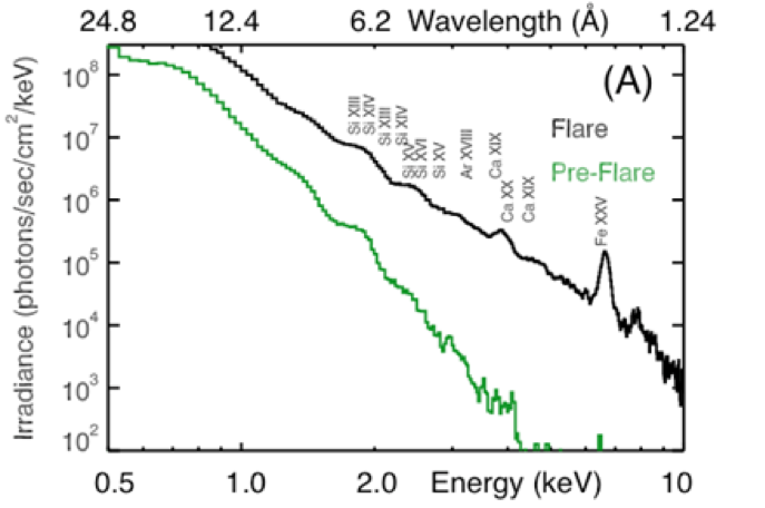
This graph has a lot going on, so let’s break it down. The vertical axis is the aforementioned irradiance, or the density of the photons over an area during a given time period. The bottom horizontal axis is the energy observed, and the top horizontal axis shows the wavelength that corresponds to those energies. The green line is the observations of irradiance before the M5.0 flare, and the black line is during the flare itself. Along the black line, the chemicals that corresponds to the energy/wavelengths are also labelled.
As this graph shows, once the flare hit, all of the measurements shift upwards from the green line to the black line: The overall irradiance of the X-rays increased by a factor of 200. You can also see there are significant spikes at wavelengths/energies corresponding to Iron (Fe XXV), Silicon (Si) and Calcium (Ca), indicating that these chemicals played a large role in the solar flare, and the coronal heating it produced.
Now MinXSS-2, the next generation of MinXSS spacecraft, has begun to take science data, with updated instruments that will give even more detailed data on the solar soft X-rays. You can follow along with MinXSS-2’s journey through their twitter, the MinXSS website or for even more science data dives keep an eye on The Sun Spot.
![]()