By Tom Bridgman, Ph.D.
NASA’s Goddard Space Flight Center
Scientific Visualization Studio

In my nearly 20 years making visualizations at NASA’s Scientific Visualization Studio, “Argo Sun”— a simultaneous view of the Sun in various wavelengths of light — is probably one of my favorites. It is not only scientifically useful, but it’s one of the few products I’ve generated that I also consider artistic.
And like so many things, it didn’t start out with that goal. Some visualization products are the result of meticulous planning. But many, like Argo Sun, are the result of trying to solve one problem and instead stumbling across a solution to a different problem. This is its story.
…
In mid-2012, NASA’s Heliophysics Division was preparing for the launch of a new solar observatory, the Interface Region Imaging Spectrograph, or IRIS. The mission was designed to take high-resolution spectrographs of the Sun to study the solar chromosphere, the layer just above the Sun’s photosphere, or visible surface. Scientists hoped IRIS’s data would contribute to solving the coronal heating problem, a long-standing mystery of solar physics that asks why the temperature at the photosphere — 5,770 Kelvin, approximately 10,000 degrees Fahrenheit — rises to millions of Kelvin just a few thousand kilometers higher. Sandwiched inside those few thousand kilometers is the chromosphere, where IRIS would make its observations.
I was involved in producing visualizations for the IRIS mission pre-launch package, which would demonstrate the scientific value that IRIS would add on top of existing data. I sought out the best data we had on the chromosphere, which came from NASA’s Solar Dynamics Observatory, or SDO. Launched in 2010, SDO takes continuous, full-disk images of the Sun, producing terabytes of data each day. It would be the best starting point for singling out the solar chromosphere.
But the solar chromosphere is very thin. At only about 3,000 kilometers thick, compared to 695,700 kilometers for the entire radius of the Sun, it is about 1/2 of a percent of the Sun’s radius, or 8 pixels in SDO imagery. How could I accurately isolate this thin region in SDO imagery, using only clever data manipulation?
Two facts of physics helped me come up with a strategy. The first was knowledge that the chromosphere sits just on top of the photosphere, surrounding it like a thin wrapper covering a lollipop. The second is that the chromosphere emits light in the ultraviolet range while the photosphere emits light in the visible range. I reasoned that the Sun should look slightly bigger in ultraviolet light (lollipop plus wrapper) than in visible light (the lollipop alone). If I could lay the ultraviolet image on top of the visible light image, those extra few pixels around the edges in the ultraviolet image would be the chromosphere.
But it wasn’t quite that simple — just as visible light comes in a variety of different colors, so too ultraviolet light spans a range of different wavelengths. But SDO imagery easily demonstrated how radically different the Sun looked at different wavelengths. Which wavelength would most accurately identify the chromosphere? I really needed to test out a number of different ultraviolet wavelengths, laying them all on top of one another simultaneously to see what the differences were.
For this comparison to work, I needed two things from the SDO images:
- The precise center of the solar disk in the images. If I wanted to overlay the images on top of one another, their centers had better line up.
- A consistent scale and orientation. If one image was tilted or more zoomed in, that wouldn’t do either. They had to match scales so any features in each wavelength matched consistently.
But due to slight changes in the orientation of SDO and differences between its several telescopes, the solar images are not always perfectly centered or at precisely the same scale. When generating movies from individual telescopes, this difference is usually small enough to ignore. But this alignment was much more critical for a multi-image comparison. I needed to be sure that any differences between images could reveal the chromosphere, not the quirks of a spacecraft.
It would take almost another year for a solution to those two issues to be found. The first turning point was the Venus transit in June of 2012, when the planet passed between the SDO spacecraft and the Sun. Watching Venus wander across the Sun’s disk in multiple telescopes, the researchers could see exactly where the planet appeared in each filter and thereby tune the image scale and orientation so they matched one another. These revised parameters were incorporated into SolarSoft — a software package under continuous development for over twenty years by the solar physics community, it is the industry-standard for analyzing data from Sun-observing missions. Now I could re-project the images to a consistent scale and orientation, enabling easier comparison.
But the chromosphere was still just an 8-pixel sliver around the edge of the Sun. Inspiration from a colleague’s work would plant the seed of a solution. In February of 2013, another data visualizer in the SVS presented a draft of a visualization using multi-wavelength data from a new LandSat mission, later released here, where different wavelength filters passed over views of the ground.
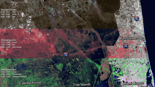
Here was a way to compare multiple wavelengths without overlapping them – instead, they are presented side by side as the object of interest passes beneath. It immediately caught my attention as an interesting technique. By the time IRIS’s observations began to roll in, I at last had the germ of an idea for revealing the chromosphere with a multi-wavelength comparison.
To apply this approach to the Sun, the window would have to be circularly symmetric and rotate in a wheel-like fashion. I also needed a window that would work for comparing at least ten different images. It quickly became clear that each wavelength should be presented as a pie-slice out of an SDO image. For this to work, precise matching across the different images of the center of the Sun, and its scale, was important; fortunately, with the update to our solar data software from the Venus Transit, I had both of those. Then, using additional software, I was able to write a shader (a software component that maps what colors should be rendered onto an object in a 3-D graphics scene) that could select a pie-slice of a given angular size from the center of the input image and map it into the output image. By staggering these pie-slices with different wavelengths around a given image, I could lay them side by side. I also realized that I could control the positioning and width of these pie-slices for each frame of the visualization, allowing them to ‘march’ around the image of the Sun appearing to reveal the view in each wavelength.
My first draft was a colorful wheel of solar imagery, which I titled SDO Peacock. A great beginning.
Generating visualizations from such large amounts of data takes a lot of computer time. Each of the 5,200 frames required loading ten different SDO image files (34 MB each) before even beginning to do the additional color work and controlling which part of each image was visible. The first time I attempted a full movie, it took an entire weekend to process. For a first run, it wasn’t perfect, but it was a taste of what was possible. There were numerous data glitches in the resulting movie. Some were due to the occasional bad frame render, others due to buggy intermediate data files left over from testing.
As the work continued, I began to feel a little strange about referring to it as a peacock — at the time, the SDO mascot was a rubber chicken called Camilla Corona, plus, as someone who grew up with the classic color peacock logo used by the NBC television network, it seemed a little awkward.

After a little digging, I came across the story of Argus Panoptes, the creature from Greek mythology who not only had many eyes, but according to the mythology, retained a connection to peacocks. It somehow seemed appropriate. I shortened the name to Argo Sun and the name stuck.
There were a number of small changes, edits and fixes over the next few weeks. Just prior to the main release, a short trailer was produced with a music track and the final version was released December 17, 2013 – a year and a half after I’d first started thinking about it.
So just how well could you see the chromosphere with these SDO images? Adjusting the width of the filter wedges to much narrower angles and positioning them, it’s possible to generate an image zooming in to the solar limb for a view. The results almost generate more questions than answers. The fuzziness at the limb — along with irregularities created by solar features in the chromosphere and the way the limb brightens when seen in ultraviolet wavelengths — makes this boundary very difficult to identify.

In the final analysis, I have to admit, the technique did not work great for showing the solar chromosphere on most displays. . . But the payoff was, nevertheless, a fascinating way to illustrate how radically different solar features appear in different wavelengths of light. As each feature moves from one filter to the next, different features appear and disappear depending on the wavelength of light: filaments off the limb of the Sun that are bright in the 30.4 nanometers filter, appear dark in many other wavelengths and sunspots which are dark in optical wavelengths are festooned with bright ribbons of plasma in ultraviolet wavelengths. I’ve had several scientists tell me this is one of the best ways to illustrate WHY we observe the Sun in so many different wavelengths – and while that might not have been my original goal, it’s one of the reasons why it turned out to be a fantastic success.
![]()