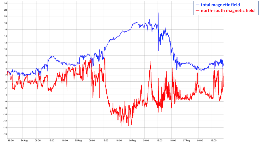
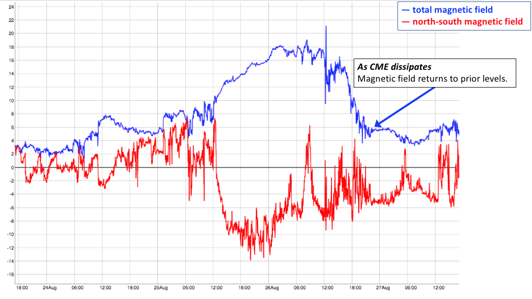
Excitement Increases as Voyager 2 sees a decrease in Heliospheric Particles

By Susannah Darling
NASA Headquarters

A few weeks ago, the Voyager 2 spacecraft beamed back the first hints that it might soon be leaving the heliosphere — the giant bubble around the Sun filled with its constant outpouring of particles, the solar wind. In the past few days, we have received even more clues to suggest that that time seems to be on its way.

Back in October, we saw a spike in the counting rate of particles detected by the High Energy Telescope of Voyager 2’s Cosmic Ray Subsystem, or CRS. The CRS High Energy Telescope detects high energy particles that come from outside our heliosphere. A rapid increase in the number of particles counted over time — that is, their counting rate — gave us the first hint that we were getting close to our heliosphere’s boundary, where these interstellar cosmic rays sneak in.

The new data that scientists are talking about comes from the Low Energy Telescope, another CRS telescope on both Voyager 1 and 2. It shows the counting rate of lower energy particles that typically originate within the heliosphere. The counting rate of these particles declines as they approach the heliopause and ultimately drop to near zero at that boundary, where the particles can escape into interstellar space.

In the following graph of the Low Energy Telescope data, right around the beginning of November, you’ll notice a pretty dramatic change: All of a sudden, the Voyager 2 counting rate of low-energy particles dropped, although it hasn’t yet dropped to nearly zero as it did when Voyager 1 entered interstellar space. Scientists will keep their eye on these graphs as one of several indicators to determine when Voyager 2 truly passes outside of the heliosphere.  Once there, Voyager will be poised to share all new data about the nature of space between the stars.

Credit: NASA/JPL/Ed Stone

The vertical axis is the count rate for the heliospheric particles, or how many low energy particles are being detected by the Low Energy Telescope of the CRS every second. The horizontal axis is time, starting in August 2018 and going to November 12th, 2018. However, note that the vertical axis is zoomed in, and stops at 17; while this is a big step in the right direction, the counting rate isn’t yet near zero, which is what we would expect if Voyager 2 was out of the heliosphere.

While there was a drop in the heliospheric particles, at the same time the higher energy telescope observed increased counting rates. This graph displays both the higher energy counting rate data (top graph) together with the lower energy data (bottom graph):

Credit: NASA/JPL/Ed Stone

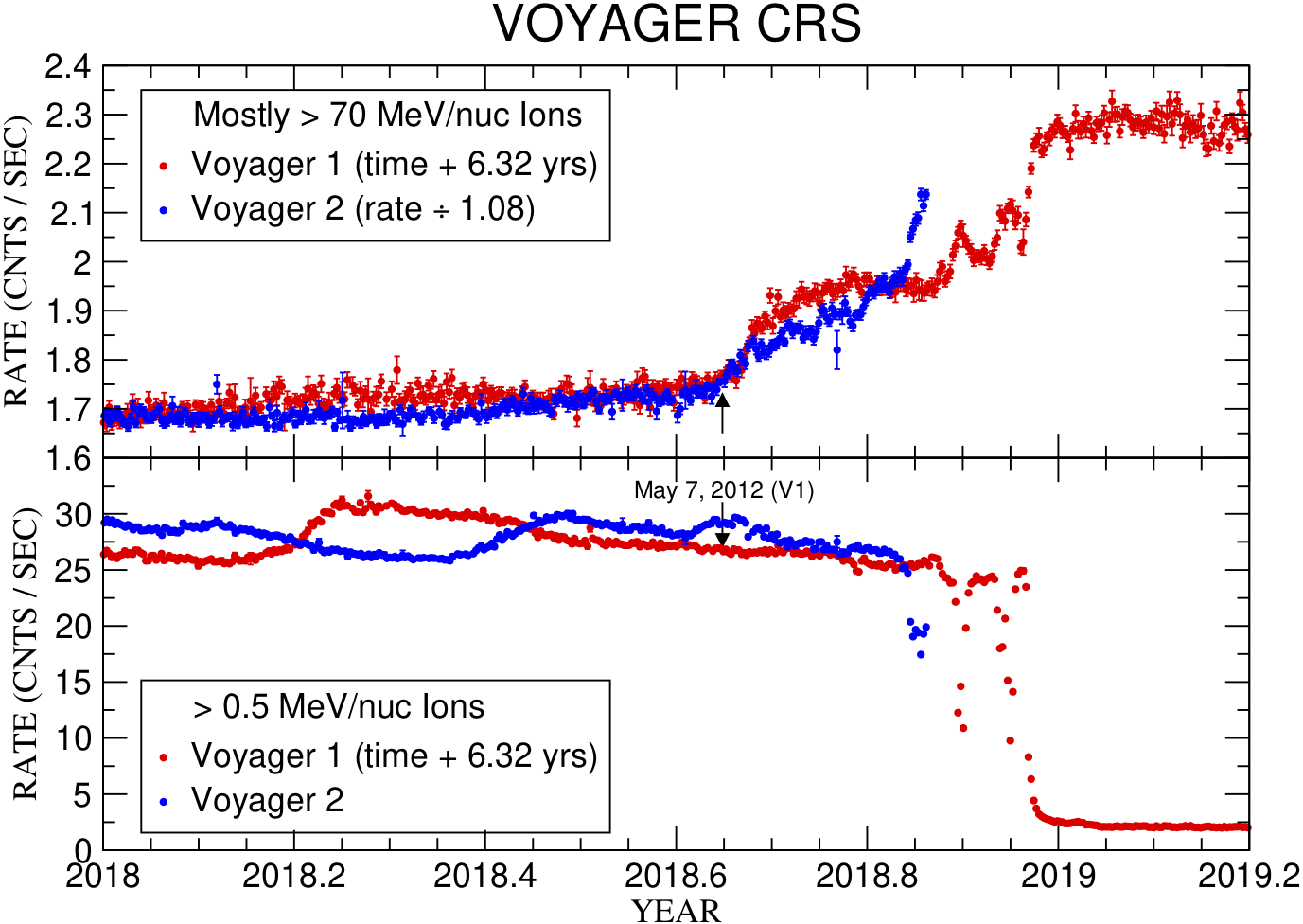
Voyager 1 data from 2012-2013 is shown in the red lines, with time shifted by 6.32 years. The Voyager 2 data from this year is shown in blue. As you can see, the High Energy Telescope of the CRS on Voyager 2 has been steadily increasing since October 2018, but the past few data points have shot up faster than expected. This loss of heliospheric particles and gains in interstellar particles is expected when leaving the heliosphere, exciting scientists that Voyager 2 is close to crossing the heliopause.

We’ll wait in anticipation to see the path Voyager 2 is taking, closely monitoring the data it sends back. Keep following the Sun Spot to get updates on the data we receive for Voyager 2, and check out JPL’s Voyager and GSFC’s Voyager websites to learn more about the Voyager missions.

How to Be an Orbital Mechanic: Reading Orbit Plots with Parker Solar Probe

By Dr. Tom Bridgman
NASA’s Goddard Space Flight Center

On Oct. 29, 2018, at about 1:04 p.m. EDT, Parker Solar Probe became the closest spacecraft to the Sun, breaking the record of 26.55 million miles from the Sun’s surface set by the Helios 2 in April 1976. But this is just the beginning. Parker Solar Probe — NASA’s mission to touch the Sun — will get closer still.

This process is the result of carefully planned orbital mechanics, which will result in 24 passes around the Sun. Parker starts off in an orbit around the Sun which is the same as Earth’s – that’s where it starts, after all – and gradually moves to a position inside the orbit of Mercury.  To do this, the spacecraft must slow down significantly (see Figure 1).

Figure 1: Parker Solar Probe orbit in the plane of the solar system. Parker orbit data from JHU Applied Physics Lab. Solar system orbit data from JPL/NAIF.

One of the fundamental principles of orbital dynamics is that if you want to change the periapsis, or point of closest approach, of an elliptical orbit, you get the most bang for your buck if you change speed at the apoapsis, or the point when you’re furthest away.

You can see this principle applied in the case of Parker Solar Probe. Figure 2 below plots Parker’s orbital velocity on the y-axis (how fast it’s moving relative to the Sun, in kilometers per second, km/s), with time plotted along the x-axis. Parker is represented by the purple curve; Mercury (black curve) and Earth (blue curve) are included for reference. [Click on the graph to see a full-size version.]

Figure 2: Parker Solar Probe orbit speed plotted with inner solar system planets for comparison. Parker orbit data from JHU Applied Physics Lab. Solar system orbit data from JPL/NAIF.

The first thing you’ll notice is that the purple line is moving up and down quite a bit, indicating changes in its orbital velocity: Parker doesn’t travel at a constant speed throughout its orbit, but rather speeds up and slows down at different points.

The little dots that appear at the spikes and the dips on the curve mark the times when Parker is either furthest from or closest to the Sun on each orbit. The aphelion positions, when Parker is farthest away from the Sun, are marked with red dots: Note that they coincide with the dips in the curve, when Parker has its slowest speed. The perihelion, or close approaches, are marked with green dots, and coincide with the spikes in the graph, where Parker is traveling fastest.

Over time, you can see that the spikes get taller: Parker’s speed at perihelion gets faster and faster.  Although the graph doesn’t directly show this, these increases in speed correspond to Parker’s perihelion moving closer and closer to the Sun: The closer it gets, more of the Sun’s gravitational energy gets translated into the spacecraft’s energy of motion, increasing its speed.  Parker launched from Earth orbit with a speed of about 17 kilometers per second (38,000 miles per hour), slower than the orbital speed of Earth (about 29 kilometers per second or 65,000 miles per hour), enabling it to ‘fall’ towards the Sun.  Accelerating in the Sun’s gravity, it reached a speed of over 95 kilometers per second (212,000 miles per hour) at the first closest approach.  But looking at the graph, we see that Parker will go faster (and closer) still, its final orbit approaching over 190 kilometers per second (425,000 miles per hour).

But how does Parker keep getting closer?  Getting closer to the Sun doesn’t come for free — each shift in the orbit requires the help of gravitational assists from Venus.  Note on the graph above that every time the spacecraft transitions to a higher speed at perihelion, or spike in the curve, there is a prior speed decrease near aphelion, or the dip in the curve, marked on the plot by a thicker red line. For Parker, these speed changes are accomplished with fly-bys of the planet Venus near Parker’s aphelion position. Unlike many gravity assists where spacecraft gain energy from sling-shotting around a planet, Parker is losing energy to Venus in order to slow down. By slowing down at aphelion, the orbit’s overall size decreases, which in turn increases the spacecraft’s speed near the Sun.

Parker doesn’t fly by Venus on every single orbit, it will only go past the planet seven times over the course of seven years – but you can spot the flybys in the graph by noticing a small jag in certain spots. If Parker is accelerating towards the Sun — i.e., on the upward slopes in the graph, after the dip in a curve — the flyby appears as a little jag in the orbit, like the one just after October 2019 and October 2021. However, some flybys occur while the spacecraft is outbound from the Sun and decelerating, like the one near July 2020, which is a little less obvious in the plot.  Each jag represents Parker moving just a bit slower, just a bit closer to the Sun – on each orbit gathering unprecedented, in situ observations of the star we live with.

Voyager 2 May Soon Be Joining Its Twin in Interstellar Space

By Susannah Darling
NASA Headquarters

In 2012, Voyager 1 — one of a pair of deep-space probes launched in 1977 — crossed into a part of space no other spacecraft had ever seen: the interstellar medium. At over 11 billion miles from the Sun, several crucial changes were detected in the data Voyager 1 was sending back to Earth – key observations to show that Voyager 1 was entering interstellar space.

All the planets in the solar system are surrounded by a constant outpouring of material from the Sun, called the solar wind, which creates a giant bubble called the heliosphere.  Eventually, this solar wind peters out, held back by the wind coming from other stars – and this is the boundary that Voyager 1 crossed. (The gravitational effect of the Sun extends much further, so the solar system itself continues out trillions of miles, with additional asteroids and cometary bodies orbiting our star.)

Now, recent data from the Voyager 2 spacecraft gives us the first indication it too is about to cross over the heliopause — the final boundary of the heliosphere — to interstellar space. Scientists are looking to what happened in Voyager 1 observations to estimate where Voyager 2 is in its own journey.  As Voyager 1 neared that border, it began to see more particles that originated outside the heliosphere and fewer that originated from inside it. It also observed that the magnetic field that Voyager 1 was experiencing changed in magnitude, increasing beyond what was typical within the rest of the heliosphere.

Naturally, scientists are watching for similar clues in Voyager 2 data. In September 2018, the spacecraft’s Cosmic Ray Subsystem, or CRS, began to measure an increase in galactic cosmic ray particles that are hitting, interacting or passing through Voyager 2. Our heliospheric particles can be differentiated from galactic cosmic rays by their energy levels: while heliospheric particles have energy signatures above .5 MeV, galactic cosmic rays have much higher energies — over 70 MeV. The increase that the Voyager 2 CRS has seen in 2018 is similar to the jump that Voyager 1 first saw back in May of 2012.

The following graph shows the data from Voyager 1 around the time it crossed over the heliopause. The vertical scale of the graph is the count rate of the galactic ray particles, or how many particles per second are interacting with the CRS on average for each day. The horizontal scale of the graph is the time, from Jan. 1, 2018 to March 14, 2019. (Note: the time has been shifted forward 6.32 years, to line up with the Voyager 2 data in the next graph). Reading from left to right, showing Voyager 1 CRS data over time, the observations show more and more of the high energy particles from the interstellar medium – indicating that the farthest reaches of the solar wind is increasingly unable to halt the progress of the incoming galactic cosmic rays.

Voyager 1 data, with time shifted forward 6.32 years. Credit: NASA/Ed Stone

This next graph adds the observations from Voyager 2’s CRS from September 2018, overlaid on top of the Voyager 1 data from 2012:

Voyager 2 data overlaid on Voyager 1 data. Credit: NASA/Ed Stone

Note how similar the two data sets are. This is our first hint that Voyager 2 is crossing through a region similar to the one that Voyager 1 did – it’s nearing the heliopause.  Perhaps the data will continue to match up perfectly – and we can expect Voyager 2 to cross out of the heliosphere by January 2019, three months after first spotting elevated galactic cosmic rays, just as Voyager 1 did.

But, perhaps not.

There are several differences between Voyager 1 and Voyager 2 that make the exact date of the crossing difficult to predict.

For one, Voyager 2 is travelling at a different angle than Voyager 1. Voyager 1 is travelling at a northern angle to the solar equator, while Voyager 2 is travelling at a southern angle. This is because of a change at Saturn, where Voyager 1 took a detour to take a closer look at Titan while Voyager 2 continued its original path. As the exact shape of the heliosphere at the boundary is not well known, these different trajectories mean that it is difficult to determine where exactly Voyager 2 will cross into the interstellar medium.

Credit: NASA

Voyager 1 also travels at 38,027 mph, while Voyager 2 goes at a reduced pace of 34,391 mph. That 3,636 mph, a 10% difference, means that Voyager 2 may take longer to cross the heliopause than Voyager 1.

Finally, there’s also the difference in the solar cycle – when Voyager 1 crossed the heliopause, the solar cycle was approaching a maximum, the phase of its cycle when it’s most active and expelling the most material. But as Voyager 2 nears the heliopause, the Sun is approaching solar minimum. This means the heliosphere itself may change shape and size, which also makes it more difficult to predict exactly where or when the heliopause will be crossed. It could take longer to cross over the heliopause, or it could happen much faster due to all these factors.

Once Voyager 2 crosses from the heliosheath into the interstellar medium, the galactic cosmic rays will level out, or plateau, much like they did with Voyager 1. Then the heliospheric particles will lessen and die down, and the magnetic field might increase in magnitude. These are the trends Voyager 1 saw, and we can expect to see them again.

Scientists will also be watching for a whole new set of observations: Voyager 2 still has an instrument powered on that was not working on Voyager 1 when it crossed the heliopause. Voyager 2’s Plasma Science instrument can measure the density, temperature and speed of the solar wind plasma, which may give more information about the differences between the heliosphere and the interstellar medium.

So, when will we get there? We’re not exactly sure — but that’s the exciting part.

Learn more about the Voyager missions and keep an eye on The Sun Spot for more information as we follow Voyager 2 into the unknown.

Here’s a Coronal Mass Ejection Right Before It Hit Earth

By Miles Hatfield
NASA’s Goddard Space Flight Center

On Aug. 20, 2018, a Coronal Mass Ejection — an explosion of hot, electrically charged plasma erupting from the Sun — made its way towards Earth. By Aug. 26 it had hit — and aurora were visible as far south as Montana and Wisconsin in the United States.

NOAA’s DSCOVR satellite (short for Deep Space Climate Observatory) watched it all go down. DSCOVR’s measurements track magnetic field strength and direction – two aspects of a CME that determine how much it will affect Earth.  These data, and the unique view of a CME that they provide, are why DSCOVR is such a useful tool for NASA’s space weather forecasters, detecting CMEs between 15 minutes to an hour before they strike Earth. Here’s a plot showing what DSCOVR saw before the CME hit it, while it was passing over, and after it passed.


The two lines show:

  • The total magnetic field strengtha combined measure of the magnetic field strength in the north-south, east-west, and towards-Sun vs. away-from-Sun directions; and
  • The north-south magnetic field strength on its own.
    (The units are in nano-Tesla — named after Nikola Tesla, the famous physicist, engineer and inventor).

(You might be wondering: Why single out the north-south magnetic field strength (red) if it’s included in the total magnetic field strength (blue)? Because Earth’s magnetic field also runs along the north-south direction — and this leads to a very special interaction that can make CMEs especially dangerous. More on that below.)

Let’s walk through what happened.

  1. Before CME hitsBefore the CME hits, DSCOVR is surrounded by the solar wind. Compared to a CME, the solar wind’s magnetic fields tend to be a little more chaotic — note the squiggly lines to the center-left of the graph. (Further to the left you can see traces of a weak CME that passed by DISCOVR on Aug 24).

Some CMEs leave the Sun so fast that they create a shock: a pile-up of solar wind plasma at their front end that creates jagged lines in DSCOVR data, like a Richter scale during an earthquake. This CME was moving comparatively slowly, so no real shock is apparent.

  1. The CME hitsAs the CME hits, DSCOVR’s total magnetic field readings (blue) get stronger. The north-south component (red) starts to plunge below zero — not all CME’s have a strong negative north-south component like this one did.

When the red line is above zero, that means that the magnetic field hitting DSCOVR is heading primarily in the northward direction, the same as Earth. No problem there — the incoming magnetic energy simply slides right along with Earth’s own fields. But if the red line goes below zero — the magnetic field direction heads south — then the incoming magnetic field is oppositely aligned to Earth’s. And you probably remember from childhood that opposite magnetic poles attract. If a CME has a strong southward magnetic field it can create havoc with Earth’s magnetic fields, peeling back the outward layers like taking the skin off of an orange. This allows particles to sneak past the magnetosphere’s boundary and rain down toward Earth.

The beginning of a CME looks very similar to the regular solar wind, so in real-time, just as it starts, space weather forecasters check plots of plasma density and speed (not shown here) to help determine if they’re really seeing a CME.

  1. DSCOVR is inside the CMEOnce inside the CME, the magnetic fields become stronger and in this case the north-south component stays largely negative (remember, that means the magnetic field is directed south and the CME can more easily disturb Earth’s fields). A CME is like an intact chunk of the Sun that has exploded outwards, taking its structured magnetic fields with it; the solar wind is more like shrapnel. Towards the end (right side) of the CME, DSCOVR was hit with a high-speed stream of solar wind — you can see that the magnetic fields start looking a little messier.
  1. The CME dissipates

Once the CME has passed, it leaves gusty, turbulent plasma in its wake before petering out into the solar wind. Magnetic field readings return to their normal levels.

Depending on DSCOVR’s observations and further simulations, warnings may be sent out to agencies that operate satellites. The Aug. 20 CME (it hit Earth on the Aug. 25, but CMEs are labeled based on when they left the Sun) was not fast enough to warrant these alerts. However, its strong north-south component was strong enough to generate a geomagnetic storm: on the 0 – 9 Kp scale, which measures the disturbance in Earth’s magnetic fields, this one clocked in at a 7. News outlets and blogs reported on it, and aurora sightings right after the event were documented on Aurorasaurus — NASA’s aurora-detecting citizen science collaboration, where real-time aurora sightings are scraped from the web via Twitter or reported directly on their website. Here’s a photo from one user in Fairbanks, Alaska, posted just after midnight on August 26.

https://twitter.com/i/web/status/1033621216886763520

The aurora outside Fort Wainwright, AK on Aug 26, 2018. Credit: Jennifer Ocampo/@jennifernocampo

Not bad!

Solar Cycle 24, in X-Ray Vision

By Miles Hatfield
NASA’s Goddard Space Flight Center

Credit: JAXA/NAOJ/NASA/SAO

September 22, 2018 marked the 12th launch anniversary of Hinode — a solar observatory collaboration between the Japan Aerospace Exploration Agency, the National Astronomical Observatory of Japan, the European Space Agency, the United Kingdom Space Agency and NASA.

Twelve years is long enough for Hinode to observe most of a complete solar cycle. The above image represents Solar Cycle 24 as observed with Hinode’s X-Ray Telescope, or XRT. The XRT observes the Sun’s hot corona, or solar atmosphere, in soft X-rays — wavelengths of light that reveal solar activity reaching tens of millions of degrees Fahrenheit.

The solar cycle refers to an 11-year-long period (on average) during which the Sun’s magnetic field flips — north becomes south, and vice versa — and magnetic activity increases and then decreases. Although driven by the Sun’s internal magnetic dynamo, the progression of the solar cycle is marked by activity visible on its surface and in the corona, including bright solar flares and dark sunspots. The corona, as documented by Hinode’s XRT, reveals an extensive amount about the Sun’s variable activity.

In the graphic above, the farthest (smallest) image is from 2007 and each image increments clockwise by one year. The nearest (largest) image is from 2013, around solar maximum. Note the enhanced presence of bright active regions in the closer images, as the Sun approaches solar maximum. Solar Cycle 24 began on January 4, 2008 with the emergence of a bright active region in the north, and is expected to reach its minimum sometime in 2019.

Hinode’s XRT has taken full-disk synoptic images twice daily for the whole mission (aside from its monthly 3-day maintenance periods).  This long baseline set of measurements extends the cycle of observations from Hinode’s predecessor, Yohkoh, which ended in 2001.

Hinode maintains a polar orbit around Earth from approximately 370 miles altitude, carrying three scientific instruments: the Solar Optical Telescope, the X-ray Telescope, and the Extreme Ultraviolet Imaging Spectrometer.

Here’s the Very First Image from NASA’s New GOLD Mission

By Tom Mason
Office of Communications and Outreach Manager
Laboratory for Atmospheric and Space Physics (LASP) at the University of Colorado Boulder

On Sept. 11, 2018, at approximately 6 a.m. local time in eastern South America, NASA’s Global-scale Observations of the Limb and Disk, or GOLD, mission sent back its very first image.

Credit: NASA/LASP/GOLD

Maps like this one enable researchers to determine global-scale temperature and composition at the dynamic region where Earth’s upper atmosphere meets space. The image shows ultraviolet light (135.6 nm) — a kind of light that’s invisible to the human eye — emitted by atomic oxygen present approximately 99 miles (160 km) above Earth’s surface. The colors in the image correspond to emission brightness: The strongest emissions are shown in red and the weakest in blue. Known as “airglow,” this light is produced by oxygen as it transitions from an excited state to a lower energy state. Outlines of the continents and a latitude-longitude grid have been added for reference.

The right side of the image shows the Sun-facing side of Earth, revealing daytime airglow, but emissions at the North and South Poles extend to the left, into the night side. These are the aurora borealis (northern lights) and australis (southern lights). The northern lights are more clearly visible in this image because their location depends on Earth’s magnetic dipole field, which is tilted southward over North America at the top left of the image. At the southern horizon, the magnetic field is tilted slightly away from the Americas.

The speck of light visible over the western horizon is an ultraviolet star, 66 Ophiuchi (HD 164284).

GOLD launched from Kourou, French Guiana, on Jan. 25, 2018, onboard the SES-14 satellite and reached geostationary orbit in June 2018. Built by the University of Colorado Boulder’s Laboratory for Atmospheric and Space Physics, and managed by NASA’s Goddard Space Flight Center in Greenbelt, Maryland, GOLD will improve our understanding of the Sun’s impact on Earth’s upper atmosphere as well as the effects from terrestrial weather below. GOLD commissioning — the period during which the instrument’s performance is assessed — began on Sept. 4 and will run through early October, as the team continues to prepare the instrument for its planned two-year science mission.

Making the Fastest Instruments Even Faster

By Mara Johnson-Groh
NASA’s Goddard Space Flight Center

Recently, NASA’s Magnetospheric Multiscale mission — MMS — was in just the right place at the right time to observe a new kind of turbulent particle jet in near-Earth space.

Credit: NASA Goddard’s Conceptual Image Lab/Lisa Poje; Simulations by: University of Chicago/Colby Haggerty; University of Delaware/Tulasi Parashar

The particle jet streamed from a particularly turbulent region called the magnetosheath, just outside the outer boundary of the Earth’s magnetic environment. It was the product of a magnetic reconnection event — an explosive process in which magnetic field lines cross and snap, flinging away nearby particles at high speeds.

MMS is the peregrine falcon of spacecraft studying Earth’s magnetic field. Its instruments were designed to capture data at speeds a hundred times faster than previous missions. Most of the time, this allows MMS to study magnetic reconnection in great detail. The fast measurements, combined with MMS’s unique flying formation— four identical spacecraft flying in a pyramid — allows us to observe phenomena no one has seen before in 3D.

But this reconnection event was special: the particles it sprayed out came so quickly, and in such small doses, that researchers had to invent a new method to be able to detect them. Here’s how it works.

MMS detects particles using its Fast Plasma Investigation instrument, or FPI. Similar instruments on previous missions were designed to take advantage of the spacecraft’s spinning to gather measurements with one sensor as it swept a 360 degree view, much like a lighthouse beacon surveys the sea. FPI, however, uses eight spaced-out sensors to capture electrons and ions streaming in from all directions simultaneously, regardless of how fast the instrument is spinning. Each sensor has a “deflector” which allows it to sample particles coming from four different directions (labeled 0 through 3 in the figure below). This allows it to take much faster measurements of the full sky, completing a cycle through each of the deflector angles every 30 milliseconds.

Deflector zones for each of the eight sensors shown. Credit: Pollack et al. 2016

But for the recent particle jet, FPI’s cutting-edge speed is still too slow; It lasted just 45 milliseconds so MMS could only gather one data point during the entire event. They needed more data.

So Amy Rager, a graduate student at NASA’s Goddard Space Flight Center in Greenbelt, Maryland, and her MMS colleagues came up with a new technique to help them analyze this briefer-than-brief event. Rager’s idea was to look at one deflector angle at a time instead of pooling them together. For each angle Rager separately interpolated the data — essentially reading between the lines and connecting the dots to gather extra data points. This allowed for measurements just 7.5 milliseconds long! The resolution of the data was reduced, since they were only looking at a fourth of the data as before, but it allowed the scientists to understand what was going on in these fleeting, action-packed moments.

In the top row, you can see the separate deflector angles, which are combined for the full measurement at bottom. By looking at the angles separately, Rager can study what’s happening on much shorter timescales. Credit: Rager et al. 2017

With the new method, the MMS scientists are hopeful they can comb back through existing datasets to find more of these events, and potentially other unexpected discoveries as well. The method may also help scientists and engineers develop faster instruments with more deflector angles in the future.

When Earth and the Moon Block SDO’s View of the Sun

By Steele Hill
NASA’s Goddard Space Flight Center

On Sept 9-10, NASA’s Solar Dynamics Observatory witnessed a double lunar transit, when the Moon passed between the SDO spacecraft and the Sun twice in just a few hours.

Sept. 9-10’s double lunar eclipse: Credit: NASA/SDO

But did you know that the Earth can also get in the way? Here’s how Earth and Lunar transits work — and why they look surprisingly different.

Due to SDO’s inclined circular orbit 23,000 miles above Earth, the Moon passes between SDO and the Sun between 2 and 5 times each year. While these transits block conventional observations of the Sun, we use them to understand the cameras in our instruments. One of these transits will someday block out an active region during a flare so that we can study the energy in that region with our instruments.

There are two periods during the year when the SDO spacecraft repeatedly has its view of the Sun either partially or fully blocked by Earth. Eclipse seasons last about three weeks, and each eclipse takes about an hour or so from beginning to end.  SDO’s 48-hour movies use a cadence of one image every 15 minutes. So, when these eclipses occur, the few black frames appear for about a second or less, just a short blip.

Interestingly, when the Moon begins to block the Sun, the Moon’s edge appears very sharp.  However, when Earth blocks part of the Sun, the edge is clearly uneven.  This is because the upper parts of Earth’s atmosphere provide inconsistent absorption of the Sun’s light, whereas the Moon has no atmosphere, so we just see the crisp horizon of the Moon.  You can see the difference in the images below.

This transit in 2014 shows the Moon passing in front of the Sun. This 2.5-hour lunar transit was the longest lunar transit so far during the mission.  The edge is quite sharp.  In both images the Sun was observed in extreme ultraviolet light. Credit: NASA/SDO
This transit by Earth in Feb 2018 lasted 1.5 hours. Note the indistinct edge. Credit: NASA/SDO

The fall 2018 eclipse season ran from August 12 through September 4. Aside from the double transit September 9–10, there will be one more on November 7.

Keep watching the Sun! You can see it all day, every day at sdo.gsfc.nasa.gov

Sneak a Peek at the Sun’s Mysterious Atmosphere with a Coronagraph

By Lina Tran and Miles Hatfield
NASA’s Goddard Space Flight Center

NASA’s STEREO spacecraft watches the Sun 24/7 — but the Sun it sees is not the one you and I see.

STEREO can see the Sun’s corona, or outer atmosphere. The only time we can see the corona from Earth with the naked eye is during a total solar eclipse, when the Moon blocks the much brighter photosphere below it.

The corona is a pretty peculiar place — following laws of physics unlike the ones we experience in our day-to-day lives. Somehow, it’s hundreds of times hotter than the Sun’s surface, and scientists don’t know why (this mystery is known as the coronal heating problem). It’s also a minefield of gigantic explosions, like solar flares and coronal mass ejections. These magnetically driven eruptions explode with the energy of a million hydrogen bombs, hurtling hot, electrically charged particles every which way — including towards Earth. Yet for most of human history, we had to wait around for an eclipse to see it.

Then in 1939, Bernard Lyot designed the coronagraph, a tool that created an artificial eclipse inside a telescope. Suddenly, the corona was open for viewing any time.

STEREO uses that technology to look at the corona to this day: for example, here’s an image taken by STEREO’s COR2 coronagraph yesterday.

Credit: STEREO

Here’s all you need to know about how coronagraphs work, and what they can tell us about the Sun’s atmosphere.

Credits: NASA’s Goddard Space Flight Center/STEREO/Joy Ng, producer

 How they work

Coronagraphs block out bright light from the Sun to reveal the dimmer areas right around it, including the corona, background stars and even passing comets. They do this in two steps. First, an occulting disk at the center of the coronagraph blocks out the photosphere. This gets rid of most of the Sun’s light, but not all — some light gets around it. So that light passes through another special part called a Lyot Stop, named after its inventor, which blocks out even more light towards the edges. That light is then refocused and after a few more corrections, we get an image where almost 99 percent of the Sun’s light has been removed.

 The occulting disk

The black circle in the middle of the image is the occulting disk, which acts like a fake Moon to block out the Sun’s photosphere. In the video above, it has a superimposed image of the Sun from another STEREO instrument, the Extreme UltraViolet Imager-A, on top of it. There are two STEREO spacecraft, and each one has two coronagraphs with occulting disks of different sizes: COR1 shows a part of the corona closer to the surface, from about 1.5 solar radii out to 4 solar radii, whereas COR2 shows the corona out to 15 solar radii. One solar radius is about 432,300 miles.

Blue space

It’s not really all blue out there. STEREO’S coronagraph images are taken in grayscale; false color is added afterwards to help researchers quickly tell which telescope the image is from and to make some features more visually apparent.

Occulting disk pylon

Credit: ESA/NASA/SOHO/SDO/GSFC

In some coronagraph images, like this one from ESA/NASA’s Solar and Heliospheric Observatory, or SOHO, you can see a dark streak across the image. That’s the shadow of the occulting disk pylon, which holds the occulting disk in place. In other coronagraphs, like STEREO’s COR1, there is no occulting disk pylon — the occulting disk is attached directly to the lens. In yet others like STEREO’S COR2, shown above, the occulting disk pylon is there, but so out of focus that you can’t see it.

Diffraction patterns

Faint ripples around the edge of the occulting disk result from diffracted light. When light enters the telescope, it hits the edge of the metal disk and bends, or diffracts, around the disk.

Coronal streamers

The bright, elongated streams of light jetting out from the disk are called coronal streamers, also known as helmet streamers for their resemblance to a knight’s pointy helmet. Streamers are loops of magnetic field lines that trap electrons within them, which create their bright appearance. The solar wind pushes against coronal streamers, stretching them out to pointy tips, where puffs of plasma can escape to form the solar wind.

Coronal mass ejections

The occasional puffs of material are coronal mass ejections, or CMEs — explosions of solar material being strewn from the Sun. The fastest CMEs can travel over two million miles per hour.

Particle snow

If a CME is directed at a spacecraft, a flurry of what looks like snow floods the image, like in the video shown above. These are high-energy particles flung out ahead of the CME at near-light speeds, striking the camera. The immediacy and intensity of this “snowstorm” reflects just how fast and strong the eruption is: Less than an hour after the start of the eruption shown in the video above, accelerated particles traversed approximately 93 million miles from the Sun to STEREO.

Background stars and comets

With the Sun’s bright light turned to low, you can see much dimmer background stars and comets. At the time of this writing, the STEREO mission has discovered 104 comets and viewed over 150.

Now you’re ready to view the very latest coronagraph images from SOHO and STEREO (scroll down). Keep watch!