Machine Learning and the Ionosphere

By Susannah Darling
NASA Headquarters

Imagine, if you will, that you are driving to your favorite restaurant. The traffic is bad, so you use your GPS to find the best route. To get your current location, your phone or GPS listens to a satellite in the Earth’s upper atmosphere. This satellite sends the GPS system information that allows it to determine where you are and the quickest way to get to your destination.

But sometimes, the signal gets interrupted, the GPS won’t load, or it points you in the wrong direction. Why does this happen?

Ryan McGranaghan, space scientist at ASTRA, LLC and NASA affiliate, tried to tackle this problem by figuring out when a GPS is right and when it’s likely to be wrong. To achieve this, McGranaghan turned to observations from past disturbances in GPS signals. He explored how to use machine learning to try and figure out what made it go haywire in each case.

The main thing he was trying to predict was a phenomenon called ionospheric scintillation.  When the electrically-charged part of our atmosphere, known as the ionosphere, becomes too disturbed, it garbles GPS signals that pass through it.

But predicting when a scintillation event is going to happen is no easy task. The atmosphere is a complicated, constantly-changing mix of physics and chemistry, and we still don’t have the ability to consider all factors for predicting when a scintillation event will occur.

To guess the future, look to the past

To start, McGranaghan looked at past data, where we already knew the outcome, and tried to use his algorithm to “guess,” based on a huge number of input variables, whether a given event would cause GPS disruption or not. It’s a bit like solving math problems and then checking your answers at the back of the book.

The graph below shows data on scintillation in the ionosphere. The vertical axis shows a calculation of how disturbed the ionosphere is over time, using data from multiple sources. The higher up on the axis, the more disturbed the ionosphere was at the time. (Click on the graph to see a larger version.)

The ionosphere is never perfectly undisturbed — the dots are always above zero — so the black dashed line on the graph is determined by scientists to mark when communication begins getting disrupted. As you can see, towards the middle of the graph particles in the ionosphere wiggled past the threshold, enough to disrupt satellite signals.

That is where machine learning comes in. McGranaghan trained a support vector machine, or SVM, to try and guess the recipe for a scintillation event.

A Support Vector Machine isn’t a real machine, made of metal and gears. Rather, it’s an algorithm, a mathematical procedure that is used to separate complicated data into two groups. In this case, the support vector machine tried to guess, while only looking at the ingredients and not the outcome, which were “scintillation events” — dots that landed above the dashed line — and which “non-scintillation events,” landing below.

To do this, you have to first give the SVM some training data for it to practice on, where you show it both the ingredients and the outcomes. From this training data, it tries to “learn” (hence “machine learning”) which ingredients tend to produce which kind of outcomes, and then come up with a general rule.

After a lot of the training data is fed into the algorithm and it has had plenty of time to practice, then you give it new data. Now you’re showing just the ingredients, keeping the outcome hidden, and it tries to guess. Based on its experience with the training data, how well does it guess?

Understanding the Results

In the case of ionospheric scintillation events, there are a few different kinds of guesses.

There are the two ways it can be right: guessing it was a scintillation event, and it really was — we’ll call that a hit — or guessing that it wasn’t a scintillation event, and it wasn’t — we’ll call that a correct rejection.  In the graph below, these are color-coded as follows:

Correct responses
Hit – Green
Correct Rejection – Blue

There are two ways to be wrong as well: guessing that there wasn’t a scintillation event, and there was — a miss — and guessing that there was a scintillation event and there wasn’t — a false alarm.

Incorrect responses
Miss – Red
False Alarm – Yellow

After feeding the data to the algorithm, the SVM made its guesses. We’ll now color-code the same data we saw above, but according to this new color scheme:

As you can see, it looks very similar to the previous graph, now in technicolor. Those colors are the result of the SVM identifying scintillation, and scientists marking how “correct” the SVM was.

The dark blue dots reveal where the SVM correctly identified that it was not a scintillation event. If the SVM had incorrectly identified that there was no scintillation event — a miss — the color would be red.

The green dots are cases where the SVM correctly identified that scintillation is happening. Notice that it correctly identified all the dots that were above the dashed line as scintillation events. But also notice the yellow dots. Those mean the SVM incorrectly identified those data points as scintillation — a little overzealous in identifying an event as scintillation. These false alarms mean the SVM is predicting scintillation when it is not occurring, at least not to a degree that would interrupt signals.

The Future of Scintillation Predictions

This is just the beginning of a potentially powerful tool for predicting ionospheric scintillation. In the future, the SVM algorithm could be taught to be more careful about what it labels as scintillation; or, another machine learning algorithm could be applied to get more accurate results.

Regardless, it would be up to the scientist reading the predictions to make the final decisions: both when the scintillation events could occur, and the best way to manage the loss of communication with the satellite.

Friday’s Solar Prominence

By Miles Hatfield
NASA’s Goddard Space Flight Center

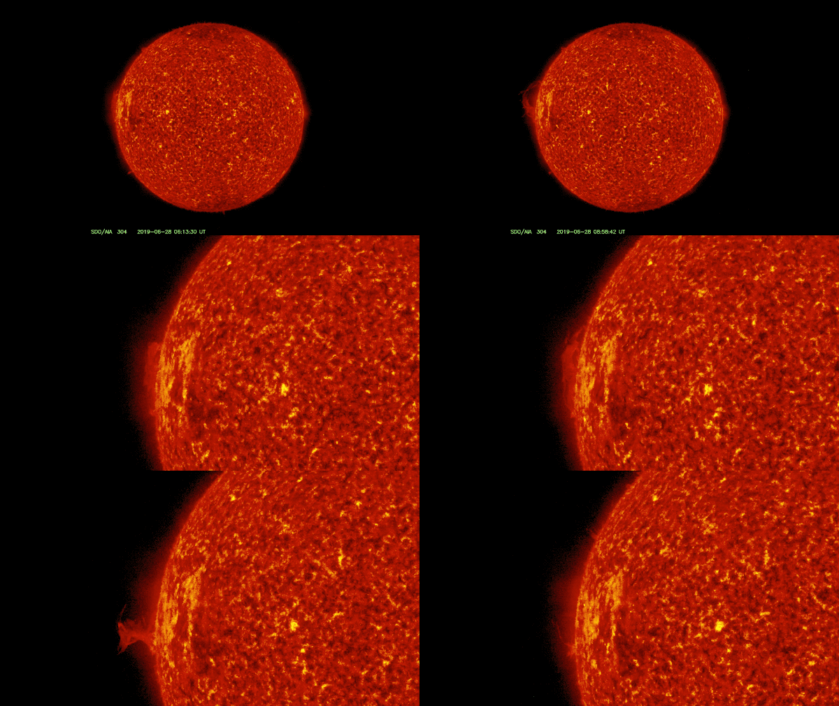
On Friday, June 28, NASA’s Solar Dynamics Observatory observed a solar prominence erupting off the limb, or edge, of the Sun.

A solar prominence erupted from the Sun on June 28, 2019. This view comes from SDO’s 304 Angstrom telescope, which shows light emitted from Helium at about 90,000 degrees Fahrenheit. Credit: NASA/SDO/Genna Duberstein

Solar prominences are loops of comparatively cold, dense solar material that become suspended in the Sun’s super-hot outer atmosphere. Because they are colder and denser than their surroundings, they are readily observed by SDO’s 304 Angstrom telescope, shown here. This telescope captures light emitted by Helium atoms at about 90,000 degrees Fahrenheit. The temperature in the surrounding corona, the Sun’s outer atmosphere, can reach a few million degrees Fahrenheit.

Prominences, like most solar eruptions, form over active regions: places where the Sun’s magnetic field is especially intense and complex. Active regions can last for months, making several trips around the Sun (each complete solar rotation is known as a Carrington rotation, and takes about ~27 days). They are difficult to track unless the Sun is close to solar minimum and solar activity is low, as it is now. This active region is currently on its fifth Carrington rotation.

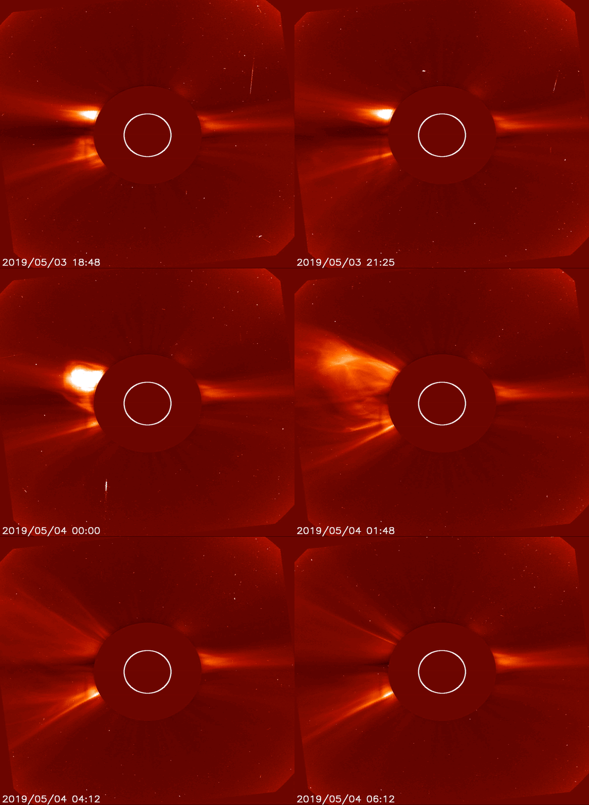
And it has been busy. Just before it began its third rotation in early May, this active region erupted with two back-to-back coronal mass ejections, or CMEs, that were captured by the NASA/ESA Solar and Heliospheric Observatory, or SOHO spacecraft. CMEs are explosions of hot solar material that shoot out from the Sun into space. They are best observed in coronagraph images, like the one shown below, which block out the light from the Sun’s bright surface to observe the dimmer surrounding corona.

A pair of CMEs erupting from Active Region 2740/2741 captured by the SOHO spacecraft. Credit: NASA/ESA/SOHO

To Study the Solar Wind, Cite your Sources

By Miles Hatfield and Lina Tran
NASA’s Goddard Space Flight Center

The solar wind — the hot gas streaming from the Sun — shapes the very space around us.  It douses the solar system in a soup of energetic particles and magnetic fields. It sparks aurora on Earth and Jupiter. It has changed the very habitability of planets — four billion years ago, it blew away Mars’s atmosphere.

Credit: NASA

But there’s still much we don’t understand about the solar wind. As NASA plans to send more spacecraft and astronauts to space, understanding the solar wind is key to protecting them on their journey.

One of the biggest open questions about the solar wind is where, exactly, it comes from. By the time we first detect it with spacecraft close to Earth, the solar wind has already traveled 92 million miles along a winding and convoluted path. Mapping its full journey — from Sun to spacecraft — takes careful measurements and sophisticated computer models.

Here’s how Samantha Wallace, a Ph.D. candidate at the University of New Mexico, does it.

Start with a Magnetogram

The first step is to create a magnetic map of the Sun, since the solar wind travels along the Sun’s magnetic field lines as they spiral outwards from our star.

She starts at the solar surface, known as the photosphere, where the magnetic fields can be imaged with special cameras. But Wallace doesn’t want to image the entire photosphere: She only wants the part that faces the Earth. That’s the only part that blows solar wind towards our planet. (And towards NASA’s Advanced Composition Explorer, or ACE spacecraft, which detects the solar wind.)

But capturing a picture of the Sun’s Earth-facing side isn’t so simple, because the Sun won’t hold still. It rotates by about 13 degrees every day, completing one full revolution — known as a Carrington rotation — about every 27 days.

Scientists like Wallace overcome this challenge by taking snapshots of the Earth-facing side of the Sun as it rotates, day by day. Each snapshot reveals a slightly different portion of the Sun. A new part comes into view while an old part rotates past the horizon. Once the Sun completes a full Carrington rotation, they stitch together the images into a single rectangular plot. The result is a 2-dimensional map that contains information about the entire surface of the Sun at the moment it was facing Earth. It looks something like this:

Credits: NSF/National Optical Astronomy Observatory

This is a magnetic map of the Sun’s photosphere. The top and bottom of the graph are the north and south poles of the Sun, respectively. Along the left and right, the graph depicts the Sun’s Earth-facing surface as it rotated a full 360. Different shades of gray show the strength and direction of the magnetic field. Darker colors are magnetic fields that point in towards the Sun, lighter point away, and medium is a neutral magnetic field.

This map is a start, but it doesn’t tell us where the solar wind truly originates. After it leaves the surface, the hot gas imaged in this map weaves through tangled magnetic fields until it reaches the corona. There, at the Sun’s outer atmosphere, it can escape and become the solar wind.

So, next, Wallace needs to model that coronal magnetic field.

Model the Corona

We don’t have the capability to directly measure the magnetic fields in the corona yet. Instead, scientists use models to predict how the magnetic field at the solar surface transforms as it expands outwards.

Using a model, Wallace estimates the coronal magnetic field. She starts with the observed photospheric field. Then she extrapolates outwards, by a distance about two and a half times the diameter of the Sun, to estimate the coronal magnetic field. Here’s what it looks like:

Credits: NASA/NOAA

The corona’s magnetic field looks much simpler and smoother that the photosphere. On the upper half, the uniform dark gray shows magnetic fields pointing in toward the Sun. On the bottom half, light gray shows magnetic fields pointing away. At the photosphere, depicted in the first graph, the Sun’s magnetic field is complex and rippled. But by the time we reach the corona, that magnetic field has smoothed out as it empties into the solar wind. North and south meet in the middle at the yellow wiggly line. This line marks the heliospheric current sheet, where the Sun’s magnetic field abruptly changes direction.

Connect It to the Spacecraft

Now, when Wallace looks at ACE’s solar wind measurements, she finally has what she needs to cite their sources on the Sun.

Once the solar wind exits the corona, it travels more or less in a straight line. Wallace uses a model that follows individual parcels of solar wind along those straight paths until they reach ACE. Once she connects all the dots, it looks something like this:

Credits: NASA/NOAA/NSF/NOAO

Red crosshairs mark which parts of the Sun were directly in front of ACE as it collected measurements. The red vertical lines also note the date when ACE measured a specific parcel of the solar wind.

The yellow lines connect the solar wind that ACE measured at that time to their origins on the surface. As you can see, they come from all over the Sun! Once those parcels of solar wind navigate through the corona, they have already been re-directed quite a bit.

Solve Solar Mysteries

With the 2018 launch of NASA’s Parker Solar Probe, scientists have entered a new era in the study of the solar wind. As Parker passes closer to the Sun than any spacecraft before it, it is observing the solar wind in its freshest state yet. These observations will be key to prying open new questions about the solar wind and the complicated processes on the Sun that produce it.

Credit: NASA SVS/SDO/Tom Bridgman

To prepare for whatever they’ll find in Parker’s data, Wallace and her coauthors used the techniques described here. But the applied it not to ACE, but rather to the second closest spacecraft to the Sun. The German-American Helios mission, launched in 1974, flew as close as 27 million miles from the solar surface. Using archival data, Wallace and her coauthors mapped Helios’s 45-years-old solar wind observations back to the Sun. It was the first time this had ever been done for Helios. The results have already shed light on the nature of the slow solar wind. . . And they also whet scientists’ appetite for the insights that lay ahead as Parker beams its data back to Earth.

Dancing the Lunar Transit

By Sarah Frazier
NASA’s Goddard Space Flight Center

On March 6, 2019, our Solar Dynamics Observatory, or SDO, witnessed a lunar transit — where both the Sun and Moon displayed a little odd behavior.

First, there was the transit itself. A lunar transit occurs when the Moon passes between SDO and the Sun, blocking the satellite’s view. But instead of appearing on one side of the frame and disappearing on the other, the Moon seemed to pause and double back partway through crossing the Sun. No, the Moon didn’t suddenly change directions in space: This is an optical illusion, a trick of perspective.

Illustration of the relative motion of the Moon and SDO during the lunar transit
NASA’s Solar Dynamics Observatory spotted a lunar transit just as it began the transition to the dusk phase of its orbit, leading to the Moon’s apparent pause and change of direction during the transit. This animation (with orbits to scale) illustrates the movement of the Moon, its shadow and SDO. Credits: NASA/SDO

Here’s how it happened: SDO is in orbit around Earth. When the transit started, the satellite was moving crosswise between the Sun and Earth, nearly perpendicular to the line between them, faster than the Moon. But during the transit, SDO started the dusk phase of its orbit — when it’s traveling around towards the night side of Earth, moving almost directly away from the Sun — but no longer making any progress horizontally to the Sun. The Moon, however, continued to move perpendicular to the Sun and thus could “overtake” SDO. From SDO’s perspective, the Moon appeared to move in the opposite direction.

The second, subtler part of this celestial dance seemed to come from the Sun itself. If you look closely, you may notice the Sun seems to wiggle a bit, side-to-side and up and down, during the transit. That’s another result of SDO’s perspective, though in a different way.

SDO relies on solar limb sensors to keep its view steady and focused on the Sun. These limb sensors consist of four light sensors arranged in a square. To keep the Sun exactly centered in its telescopes, SDO is trained to move as needed to keep all four sensors measuring the same amount of light.

But when the Moon covers part of the Sun, the amount of light measured by some of the sensors drops. This makes SDO think it’s not pointed directly at the Sun, which would cause SDO to repoint — unless that function gets overridden.

Since SDO’s fine guidance system wouldn’t be much use during a lunar transit regardless, the mission team commands the spacecraft to disregard limb sensor data at the beginning of such transits. This loss of fine guidance accounts for some of the Sun’s apparent movement: SDO is now pointing at a general Sun-ward spot in space, instead of keeping its view steady using the much more accurate limb sensors.

The other factor behind the apparently wiggly Sun is temperature. SDO’s instruments are designed to work in the full glare of the Sun’s light and heat. When the Moon’s shadow passes over the spacecraft, the instruments quickly cool in the vacuum of space and start to bend and flex. The flexing of the front part of the telescope can make it look like the image is moving around in the frame.

SDO’s operators use strategically-placed heaters onboard the spacecraft to minimize this flexing as much as possible and to get back to providing science-quality data — images that are focused, centered and steady — as quickly as possible.

You can see and download SDO’s data — science-quality and otherwise — at sdo.gsfc.nasa.gov/data.

The Story of Argo Sun

By Tom Bridgman, Ph.D.
NASA’s Goddard Space Flight Center
Scientific Visualization Studio

The Argo Sun Visualization. Credit: NASA/Tom Bridgman

In my nearly 20 years making visualizations at NASA’s Scientific Visualization Studio, “Argo Sun”— a simultaneous view of the Sun in various wavelengths of light — is probably one of my favorites.  It is not only scientifically useful, but it’s one of the few products I’ve generated that I also consider artistic.

And like so many things, it didn’t start out with that goal. Some visualization products are the result of meticulous planning. But many, like Argo Sun, are the result of trying to solve one problem and instead stumbling across a solution to a different problem. This is its story.

In mid-2012, NASA’s Heliophysics Division was preparing for the launch of a new solar observatory, the Interface Region Imaging Spectrograph, or IRIS.  The mission was designed to take high-resolution spectrographs of the Sun to study the solar chromosphere, the layer just above the Sun’s photosphere, or visible surface. Scientists hoped IRIS’s data would contribute to solving the coronal heating problem, a long-standing mystery of solar physics that asks why the temperature at the photosphere — 5,770 Kelvin, approximately 10,000 degrees Fahrenheit — rises to millions of Kelvin just a few thousand kilometers higher. Sandwiched inside those few thousand kilometers is the chromosphere, where IRIS would make its observations.

I was involved in producing visualizations for the IRIS mission pre-launch package, which would  demonstrate the scientific value that IRIS would add on top of existing data. I sought out the best data we had on the chromosphere, which came from NASA’s Solar Dynamics Observatory, or SDO. Launched in 2010, SDO takes continuous, full-disk images of the Sun, producing terabytes of data each day. It would be the best starting point for singling out the solar chromosphere.

But the solar chromosphere is very thin. At only about 3,000 kilometers thick, compared to 695,700 kilometers for the entire radius of the Sun, it is about 1/2 of a percent of the Sun’s radius, or 8 pixels in SDO imagery. How could I accurately isolate this thin region in SDO imagery, using only clever data manipulation?

Two facts of physics helped me come up with a strategy. The first was knowledge that the chromosphere sits just on top of the photosphere, surrounding it like a thin wrapper covering a lollipop. The second is that the chromosphere emits light in the ultraviolet range while the photosphere emits light in the visible range. I reasoned that the Sun should look slightly bigger in ultraviolet light (lollipop plus wrapper) than in visible light (the lollipop alone). If I could lay the ultraviolet image on top of the visible light image, those extra few pixels around the edges in the ultraviolet image would be the chromosphere.

But it wasn’t quite that simple — just as visible light comes in a variety of different colors, so too ultraviolet light spans a range of different wavelengths. But SDO imagery easily demonstrated how radically different the Sun looked at different wavelengths. Which wavelength would most accurately identify the chromosphere? I really needed to test out a number of different ultraviolet wavelengths, laying them all on top of one another simultaneously to see what the differences were.

For this comparison to work, I needed two things from the SDO images:

  1. The precise center of the solar disk in the images. If I wanted to overlay the images on top of one another, their centers had better line up.
  2. A consistent scale and orientation. If one image was tilted or more zoomed in, that wouldn’t do either. They had to match scales so any features in each wavelength matched consistently.

But due to slight changes in the orientation of SDO and differences between its several telescopes, the solar images are not always perfectly centered or at precisely the same scale.  When generating movies from individual telescopes, this difference is usually small enough to ignore.  But this alignment was much more critical for a multi-image comparison.  I needed to be sure that any differences between images could reveal the chromosphere, not the quirks of a spacecraft.

It would take almost another year for a solution to those two issues to be found. The first turning point was the Venus transit in June of 2012, when the planet passed between the SDO spacecraft and the Sun. Watching Venus wander across the Sun’s disk in multiple telescopes, the researchers could see exactly where the planet appeared in each filter and thereby tune the image scale and orientation so they matched one another.  These revised parameters were incorporated into SolarSoft — a software package under continuous development for over twenty years by the solar physics community, it is the industry-standard for analyzing data from Sun-observing missions. Now I could re-project the images to a consistent scale and orientation, enabling easier comparison.

But the chromosphere was still just an 8-pixel sliver around the edge of the Sun. Inspiration from a colleague’s work would plant the seed of a solution. In February of 2013, another data visualizer in the SVS presented a draft of a visualization using multi-wavelength data from a new LandSat mission, later released here, where different wavelength filters passed over views of the ground.

Multi-wavelength view of LandSat 8 data. Credit: NASA/Alex Kekesi

Here was a way to compare multiple wavelengths without overlapping them – instead, they are presented side by side as the object of interest passes beneath. It immediately caught my attention as an interesting technique. By the time IRIS’s observations began to roll in, I at last had the germ of an idea for revealing the chromosphere with a multi-wavelength comparison.

To apply this approach to the Sun, the window would have to be circularly symmetric and rotate in a wheel-like fashion. I also needed a window that would work for comparing at least ten different images.  It quickly became clear that each wavelength should be presented as a pie-slice out of an SDO image. For this to work, precise matching across the different images of the center of the Sun, and its scale, was important; fortunately, with the update to our solar data software from the Venus Transit, I had both of those.  Then, using additional software, I was able to write a shader (a software component that maps what colors should be rendered onto an object in a 3-D graphics scene) that could select a pie-slice of a given angular size from the center of the input image and map it into the output image.  By staggering these pie-slices with different wavelengths around a given image, I could lay them side by side.  I also realized that I could control the positioning and width of these pie-slices for each frame of the visualization, allowing them to ‘march’ around the image of the Sun appearing to reveal the view in each wavelength.

My first draft was a colorful wheel of solar imagery, which I titled SDO Peacock. A great beginning.

Generating visualizations from such large amounts of data takes a lot of computer time. Each of the 5,200 frames required loading ten different SDO image files (34 MB each) before even beginning to do the additional color work and controlling which part of each image was visible. The first time I attempted a full movie, it took an entire weekend to process. For a first run, it wasn’t perfect, but it was a taste of what was possible.  There were numerous data glitches in the resulting movie.  Some were due to the occasional bad frame render, others due to buggy intermediate data files left over from testing.

As the work continued, I began to feel a little strange about referring to it as a peacock — at the time, the SDO mascot was a rubber chicken called Camilla Corona, plus, as someone who grew up with the classic color peacock logo used by the NBC television network, it seemed a little awkward.

Camilla Corona, the NASA SDO mascot. Credit: NASA Solar Dynamics Observatory

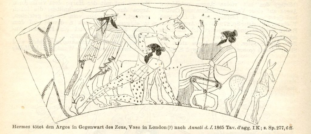
After a little digging, I came across the story of Argus Panoptes, the creature from Greek mythology who not only had many eyes, but according to the mythology, retained a connection to peacocks.  It somehow seemed appropriate.  I shortened the name to Argo Sun and the name stuck.

Drawing of an image from a 5th century BCE Athenian red figure vase depicting Hermes slaying the giant Argus Panoptes. Note the eyes covering Argus’ body. Credit: Wilhelm Heinrich Roscher (Public domain)

There were a number of small changes, edits and fixes over the next few weeks.  Just prior to the main release, a short trailer was produced with a music track and the final version was released December 17, 2013 – a year and a half after I’d first started thinking about it.

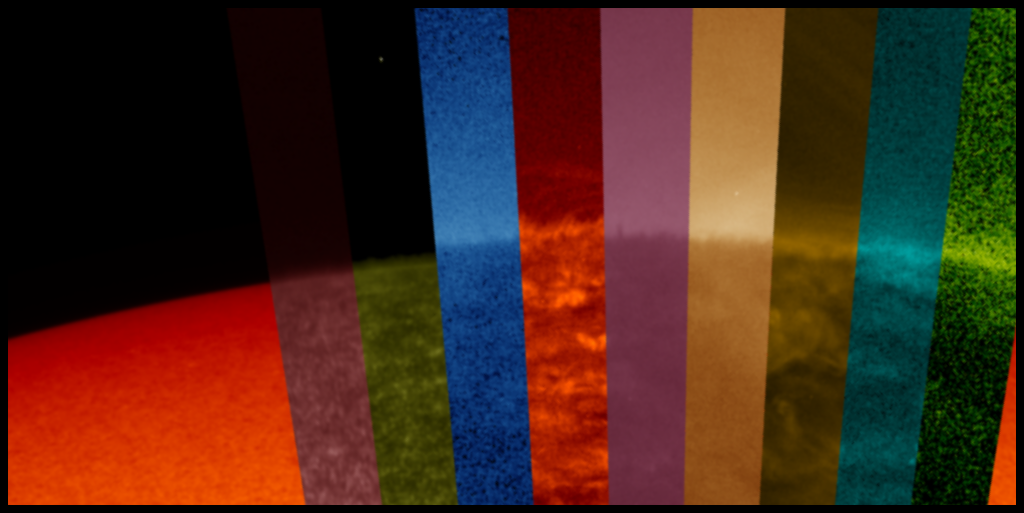
So just how well could you see the chromosphere with these SDO images? Adjusting the width of the filter wedges to much narrower angles and positioning them, it’s possible to generate an image zooming in to the solar limb for a view.  The results almost generate more questions than answers.  The fuzziness at the limb — along with irregularities created by solar features in the chromosphere and the way the limb brightens when seen in ultraviolet wavelengths — makes this boundary very difficult to identify.

How well you could distinguish the chromosphere with this technique? Not very well. Credit: Tom Bridgman

In the final analysis, I have to admit,  the technique did not work great for showing the solar chromosphere on most displays. . . But the payoff was, nevertheless, a fascinating way to illustrate how radically different solar features appear in different wavelengths of light.  As each feature moves from one filter to the next, different features appear and disappear depending on the wavelength of light: filaments off the limb of the Sun that are bright in the 30.4 nanometers filter, appear dark in many other wavelengths and sunspots which are dark in optical wavelengths are festooned with bright ribbons of plasma in ultraviolet wavelengths.  I’ve had several scientists tell me this is one of the best ways to illustrate WHY we observe the Sun in so many different wavelengths – and while that might not have been my original goal, it’s one of the reasons why it turned out to be a fantastic success.

Artifacts and Other Imaging Anomalies Taken by NASA’s Solar Imagers

By Steele Hill
NASA’s Goddard Space Flight Center

NASA’s Sun-observing spacecraft produce some pretty breathtaking images of our star — everything from detailed closeups of its surface, to wide-field views of its expansive outer atmosphere.

Credit: NASA/SDO
Credit: NASA/SOHO


But on occasion, the acrobatics of light that can produce some odd photographic effects. Here are some of the more common imaging anomalies and explanations for why they occur.

1. Bending

Coronagraphs are designed to image the Sun’s corona, or outer atmosphere — but occasionally, other astronomical objects sneak into the picture. When they do, they can produce some strange image artifacts.

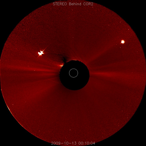
In some cases, the artifact is due to the instrument itself getting in the way. For example, note the “butterfly” shape of Venus in the STEREO coronagraph (COR2) image below at the 10 o’clock position. That’s caused by diffraction, or bending, of Venus’s light off of the occulter stem — the  strip of material, too out-of-focus to be seen in this image, that holds the dark disc in the center to block the bright Sun.

Credit: NASA/STEREO

2. Bleeding

In other cases, the astronomical objects are just too bright, saturating the instrument’s sensitive detectors and leaving vertical or horizontal streaks of light across the image.

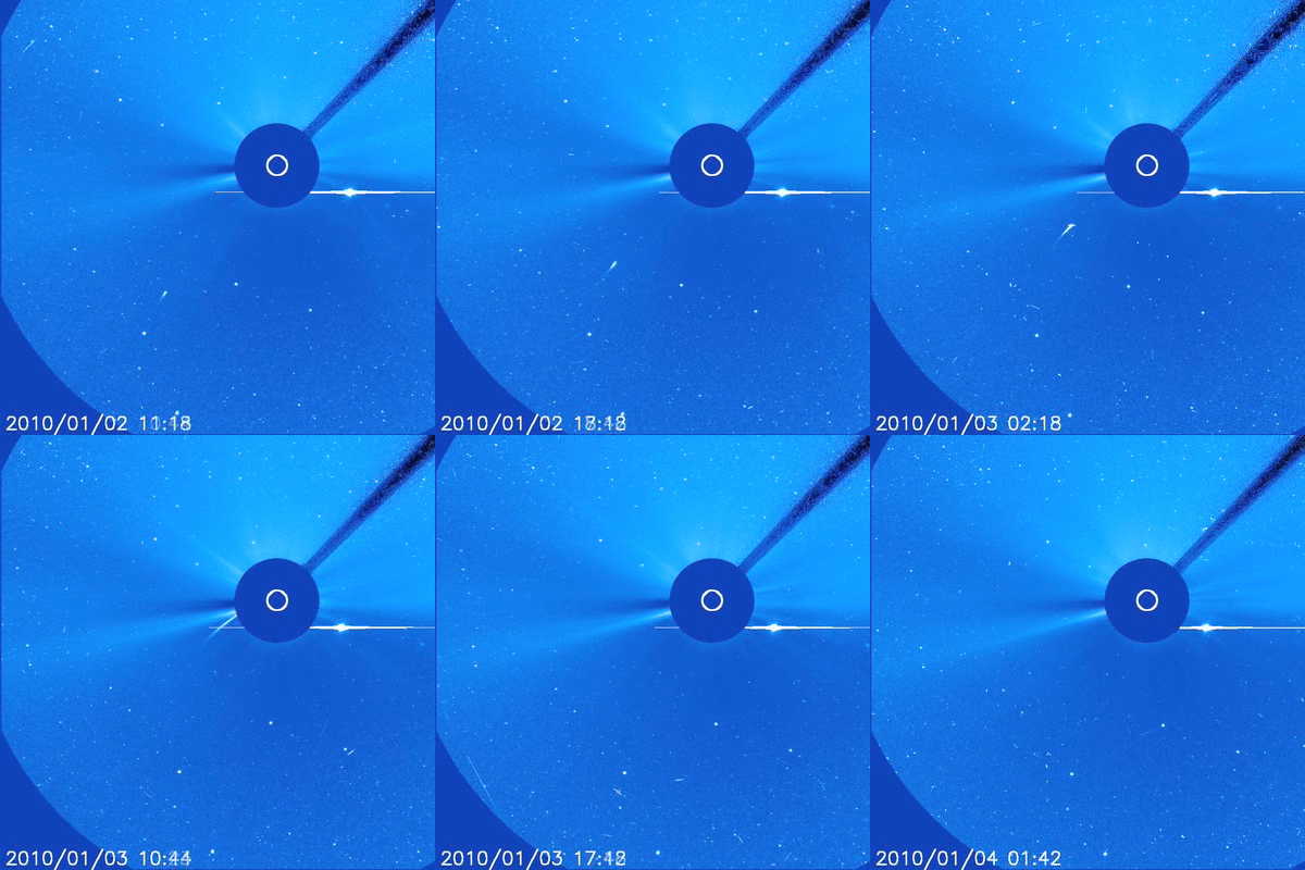
For example, consider this video from the SOHO spacecraft, compiled from data taken Jan. 2-4, 2010. As a Sun-grazing comet streams across the sky, Venus is visible just to the lower right of the Sun. Notice how the planet’s light smears out to both sides — that’s the “bleeding” of the excess signal along the detector’s columns.  Often the heads of bright comets will show the same aberration. (The attentive observer will notice Mars, a small dot of in the upper left, moving left to right).

Credit: NASA/SOHO

3. Blooming

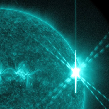
In a different scenario, NASA’s Solar Dynamics Observatory captured this X7 (major) solar flare erupting on Aug. 9, 2011, shown here in extreme ultraviolet light. The flare caused very bright saturation and “blooming” artifacts above and below the flare region, causing extended diffraction patterns to spread out in an “X” formation across the SDO imager.

Credit: NASA/SDO

4. Banding

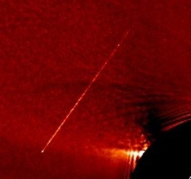
As a final example, we look at highly energetic particles that travel through space. Some of these, known as solar energetic particles, originate from the Sun, while others, known as galactic cosmic rays, come from outside the solar system. When they pass through the detectors, they can produce thin bright bands or streaks of light.  This one was observed by a STEREO coronagraph.

Credit: NASA/SDO

Although they may seem pesky, these artifacts and anomalies are normal, expected results from properly functioning spacecraft. But they remind us that images, like any other form of data, don’t speak for themselves: what we see is a product both of nature and the instruments we use to observe it.

Solar X-Rays: how a CubeSat sheds new light on the Sun’s X-Ray emissions 

By Susannah Darling
NASA Headquarters

On December 3rd, 2018 the second Miniature X-Ray Solar Spectrometer, MinXSS-2, was launched. MinXSS-2 is a NASA CubeSat designed to study the soft X-ray photons that burst from the Sun during solar flares. Along the way, it may answer a long-standing mystery of what heats up the Sun’s atmosphere, the corona. Let’s explore the data from the CubeSat’s predecessor, MinXSS-1, and the science technique known as X-ray spectroscopy that it uses.

Think of a prism. As white light passes through a prism, it’s split into its different wavelengths and you can see the rainbow. Visible light spectroscopy is often done in high school physics classes where light emissions from certain chemicals are divided and analyzed with a diffraction grating.

When the light comes from a specific chemical, however, we don’t see the full rainbow – instead, we see tiny slivers of light from the rainbow, known as spectral lines. Hydrogen, for example, leaves four lines: one purple, one darker blue, one lighter blue and one red, making it very easy to identify.

Spectral lines corresponding to Hydrogen. Credit: Merikanto, Andrignola, CC-BY-0, via WikiMedia Commons

Every chemical leaves its own ‘fingerprint’ in the form of spectral lines. Spectroscopy uses them to work backwards and figure out the chemical composition of the material that produced the light.

X-ray spectroscopy works very similarly to visible light spectroscopy, except the lines aren’t in the visible range. Instead of a prism, researchers use a small silicon chip that the photons pass through. As these photons pass through the silicon chip, they leave a charge behind; that charge is sorted into a bin based on the amount of the charge, which identifies its wavelength. If you think back to the prism analogy, the charges are the specific colors and the bins would be the type of colors. Pale blue would go in the blue bin, jade would go in the green bin. With enough photon charges sorted in bins, you have an X-ray spectrum that allows you to determine the chemical compositions of solar flares.

Just as in visible light spectroscopy, in X-ray spectroscopy each chemical composition leaves a fingerprint of evidence: Different chemicals lead to different charge intensities. MinXSS uses these to determine the abundance of different chemicals present on the Sun.

But the Sun isn’t just a homogenous mix of chemicals — rather, different layers of the Sun contain different chemicals, and scientists have a pretty good understanding of which chemicals are where. So, when MinXSS observes a burst of X-rays from a solar flare, researchers can look at the abundance, and the specific compositions, of the chemicals observed, and identify which layer of the Sun those X-rays seem to come from. This way, scientists can determine the source of the flare – and, in turn, help determine which layer of the Sun is causing those flares to heat the corona, the Sun’s outer atmosphere, to multi-million degree temperatures.

Take a look at the following graph, showing data from MinXSS-1. The graph shows the abundance factor — a ratio of chemical elements that helps scientists identify different layers of the Sun — and how it changes over time. The vertical axis of this graph is the abundance factor, and the horizontal axis is time. Watch the green dots as time goes along the graph, from left to right:

Credit: NASA/MinXSS/Tom Woods

Starting on the left side of the graph, the green dots all match typical coronal measurements — indicating the X-rays came from the corona. At approximately 2 a.m. on July 23, 2016, a M5.0 solar flare occurred. During the solar flare, the composition of the chemicals suddenly looks more like those that typically come from the photosphere — the visible surface of the Sun — rather than the corona above. This indicates that the source of the solar flare — and the heat it produced — came up from the photosphere.

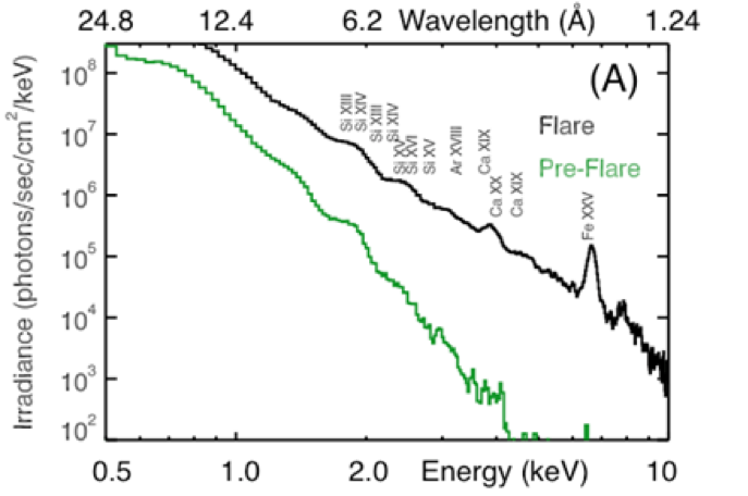
The following graph of the same event, also from MinXSS-1, looks at the irradiance of the X-rays, or the density of the photons over an area during a period of time. Here, we see a 200-fold increase in the irradiance that occurred during the flare.

Credit: NASA/MinXSS/Tom Woods

This graph has a lot going on, so let’s break it down. The vertical axis is the aforementioned irradiance, or the density of the photons over an area during a given time period. The bottom horizontal axis is the energy observed, and the top horizontal axis shows the wavelength that corresponds to those energies. The green line is the observations of irradiance before the M5.0 flare, and the black line is during the flare itself. Along the black line, the chemicals that corresponds to the energy/wavelengths are also labelled.

As this graph shows, once the flare hit, all of the measurements shift upwards from the green line to the black line: The overall irradiance of the X-rays increased by a factor of 200.  You can also see there are significant spikes at wavelengths/energies corresponding to Iron (Fe XXV), Silicon (Si) and Calcium (Ca), indicating that these chemicals played a large role in the solar flare, and the coronal heating it produced.

Now MinXSS-2, the next generation of MinXSS spacecraft, has begun to take science data, with updated instruments that will give even more detailed data on the solar soft X-rays. You can follow along with MinXSS-2’s journey through their twitter, the MinXSS website or for even more science data dives keep an eye on The Sun Spot.

Eavesdropping in Space: How NASA records eerie sounds around Earth

By Mara Johnson-Groh
NASA’s Goddard Space Flight Center

Space isn’t silent. It’s abuzz with charged particles that — with the right tools — we can hear. Which is exactly what NASA scientists with the Van Allen Probes mission are doing. The sounds recorded by the mission are helping scientists better understand the dynamic space environment we live in so we can protect satellites and astronauts.

This is what space sounds like.

To some, it sounds like howling wolves or chirping birds or alien space lasers. But these waves aren’t created by any such creature – instead they are made by electric and magnetic fields.

If you hopped aboard a spacecraft and stuck your head out the window, you wouldn’t be able to hear these sounds like you do sounds on Earth. That’s because unlike sound — which is created by pressure waves — this space music is created by electromagnetic waves known as plasma waves.

Plasma waves lace the local space environment around Earth, where they toss magnetic fields to and fro. The rhythmic cacophony generated by these waves may fall deaf to our ears, but NASA’s Van Allen Probes were designed specifically to listen for them.

The Waves instrument, part of the Electric and Magnetic Field Instrument Suite and Integrated Science — EMFISIS — instrument suite on the Van Allen Probes, is sensitive to both electric and magnetic waves. It probes them with a trio of electric sensors as well as three search coil magnetometers, which look for changes in the magnetic field. All instruments were specifically designed to be highly sensitive while using the least amount of power possible.

As it happens, some electromagnetic waves occur within our audible frequency range. This means the scientists only need to translate the fluctuating electromagnetic waves into sound waves for them to be heard. Effectively, EMFISIS allows scientists to eavesdrop on space.

When the Van Allen Probes travel through a plasma wave with fluctuating magnetic and electric fields, EMFISIS studiously records the variations. When the scientists compile the data they find something that looks like this:

Whistler Waves Recorded by NASA’s Van Allen Probes. Credit: University of Iowa

This video helps the scientists visualize the sounds coming from space. The warmer colors show us more intense plasma waves as they wash over the spacecraft. For these particular waves generated by lightning, the higher frequencies travel faster through space than those at lower frequencies. We hear this as whistling tones decreasing in frequency. These particular waves are an example of whistler waves. They are created when the electromagnetic impulses from a lightning strike travels upward into Earth’s outer atmosphere, following magnetic field lines.

Below 0.5kHz (the very bottom of the graph in the video) the sound is filled with what are known as proton whistlers. These types of waves are generated as a result of lightning strike-triggered whistlers interacting with movement of protons, not electrons. Recently, NASA’s Juno mission recorded high frequency whistlers around Jupiter — the first time they’ve been heard around another planet.

In addition to lightening whistlers, a whole ­­­­­menagerie of phenomena has been recorded. In this video we hear a whooping noise made by another type of plasma wave — chorus waves.

Chorus Waves Recorded by NASA’s Van Allen Probes. Credit: University of Iowa

Plasma wave tones are dependent on the way waves interact with electrons and how they travel though space. Some types of waves, including these chorus waves, can accelerate electrons in near-Earth space, making them more energetic. Here is another typical example of chorus waves.

Chorus Waves Recorded by NASA’s Van Allen Probes. Credit: University of Iowa

NASA scientists are recording these waves not for musical interests, but because they help us better understand the dynamic space environment we inhabit. These plasma waves knock about high-energy electrons speeding around Earth. Some of those freed electrons spiral earthward, where they interact with our upper atmosphere, causing auroras, though others can pose a danger to spacecraft or telecommunications, which can be damaged by their powerful radiation.

Excitement Increases as Voyager 2 sees a decrease in Heliospheric Particles

By Susannah Darling
NASA Headquarters

A few weeks ago, the Voyager 2 spacecraft beamed back the first hints that it might soon be leaving the heliosphere — the giant bubble around the Sun filled with its constant outpouring of particles, the solar wind. In the past few days, we have received even more clues to suggest that that time seems to be on its way.

Back in October, we saw a spike in the counting rate of particles detected by the High Energy Telescope of Voyager 2’s Cosmic Ray Subsystem, or CRS. The CRS High Energy Telescope detects high energy particles that come from outside our heliosphere. A rapid increase in the number of particles counted over time — that is, their counting rate — gave us the first hint that we were getting close to our heliosphere’s boundary, where these interstellar cosmic rays sneak in.

The new data that scientists are talking about comes from the Low Energy Telescope, another CRS telescope on both Voyager 1 and 2. It shows the counting rate of lower energy particles that typically originate within the heliosphere. The counting rate of these particles declines as they approach the heliopause and ultimately drop to near zero at that boundary, where the particles can escape into interstellar space.

In the following graph of the Low Energy Telescope data, right around the beginning of November, you’ll notice a pretty dramatic change: All of a sudden, the Voyager 2 counting rate of low-energy particles dropped, although it hasn’t yet dropped to nearly zero as it did when Voyager 1 entered interstellar space. Scientists will keep their eye on these graphs as one of several indicators to determine when Voyager 2 truly passes outside of the heliosphere.  Once there, Voyager will be poised to share all new data about the nature of space between the stars.

Credit: NASA/JPL/Ed Stone

The vertical axis is the count rate for the heliospheric particles, or how many low energy particles are being detected by the Low Energy Telescope of the CRS every second. The horizontal axis is time, starting in August 2018 and going to November 12th, 2018. However, note that the vertical axis is zoomed in, and stops at 17; while this is a big step in the right direction, the counting rate isn’t yet near zero, which is what we would expect if Voyager 2 was out of the heliosphere.

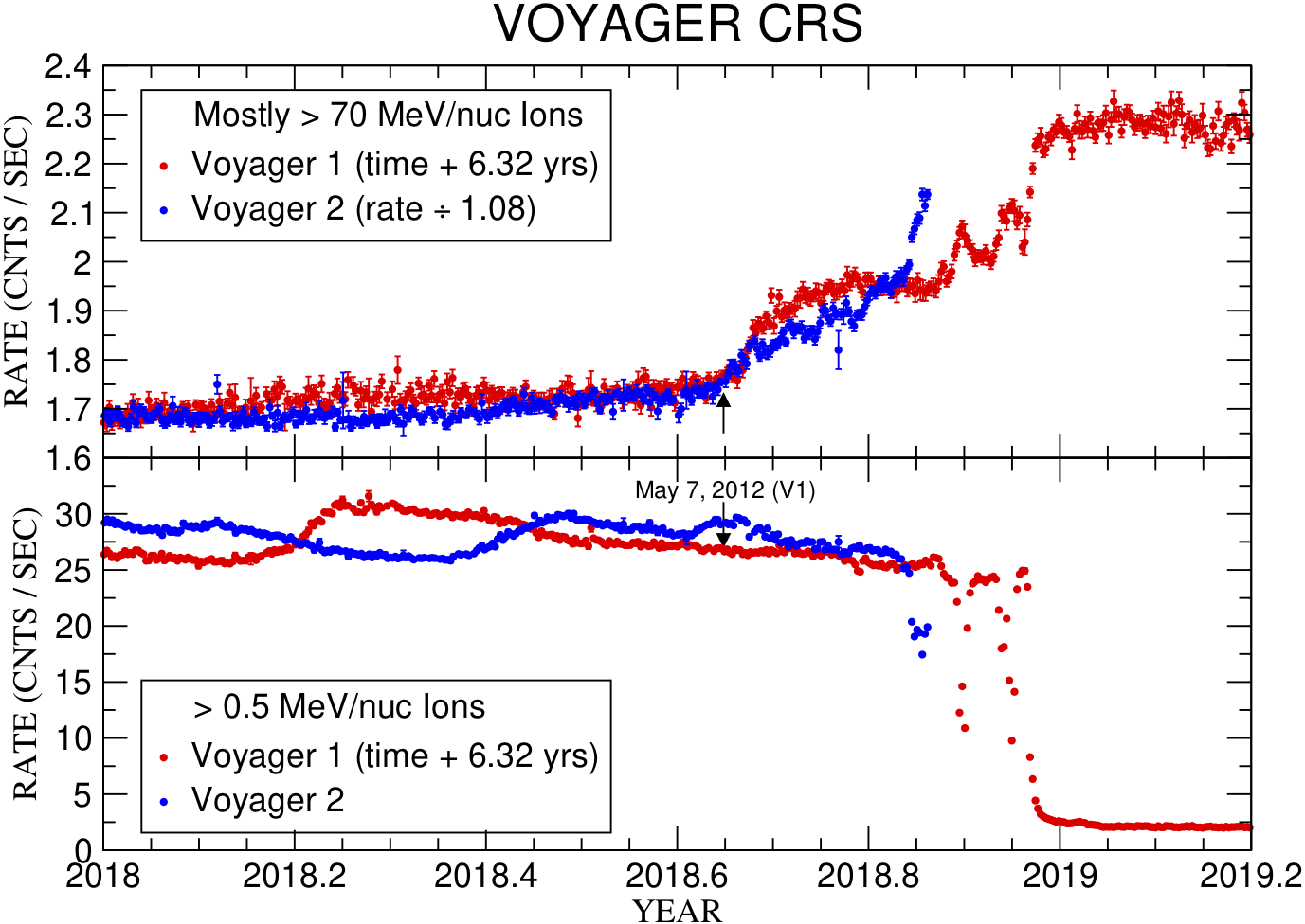
While there was a drop in the heliospheric particles, at the same time the higher energy telescope observed increased counting rates. This graph displays both the higher energy counting rate data (top graph) together with the lower energy data (bottom graph):

Credit: NASA/JPL/Ed Stone

Voyager 1 data from 2012-2013 is shown in the red lines, with time shifted by 6.32 years. The Voyager 2 data from this year is shown in blue. As you can see, the High Energy Telescope of the CRS on Voyager 2 has been steadily increasing since October 2018, but the past few data points have shot up faster than expected. This loss of heliospheric particles and gains in interstellar particles is expected when leaving the heliosphere, exciting scientists that Voyager 2 is close to crossing the heliopause.

We’ll wait in anticipation to see the path Voyager 2 is taking, closely monitoring the data it sends back. Keep following the Sun Spot to get updates on the data we receive for Voyager 2, and check out JPL’s Voyager and GSFC’s Voyager websites to learn more about the Voyager missions.

How to Be an Orbital Mechanic: Reading Orbit Plots with Parker Solar Probe

By Dr. Tom Bridgman
NASA’s Goddard Space Flight Center

On Oct. 29, 2018, at about 1:04 p.m. EDT, Parker Solar Probe became the closest spacecraft to the Sun, breaking the record of 26.55 million miles from the Sun’s surface set by the Helios 2 in April 1976. But this is just the beginning. Parker Solar Probe — NASA’s mission to touch the Sun — will get closer still.

This process is the result of carefully planned orbital mechanics, which will result in 24 passes around the Sun. Parker starts off in an orbit around the Sun which is the same as Earth’s – that’s where it starts, after all – and gradually moves to a position inside the orbit of Mercury.  To do this, the spacecraft must slow down significantly (see Figure 1).

Figure 1: Parker Solar Probe orbit in the plane of the solar system. Parker orbit data from JHU Applied Physics Lab. Solar system orbit data from JPL/NAIF.

One of the fundamental principles of orbital dynamics is that if you want to change the periapsis, or point of closest approach, of an elliptical orbit, you get the most bang for your buck if you change speed at the apoapsis, or the point when you’re furthest away.

You can see this principle applied in the case of Parker Solar Probe. Figure 2 below plots Parker’s orbital velocity on the y-axis (how fast it’s moving relative to the Sun, in kilometers per second, km/s), with time plotted along the x-axis. Parker is represented by the purple curve; Mercury (black curve) and Earth (blue curve) are included for reference. [Click on the graph to see a full-size version.]

Figure 2: Parker Solar Probe orbit speed plotted with inner solar system planets for comparison. Parker orbit data from JHU Applied Physics Lab. Solar system orbit data from JPL/NAIF.

The first thing you’ll notice is that the purple line is moving up and down quite a bit, indicating changes in its orbital velocity: Parker doesn’t travel at a constant speed throughout its orbit, but rather speeds up and slows down at different points.

The little dots that appear at the spikes and the dips on the curve mark the times when Parker is either furthest from or closest to the Sun on each orbit. The aphelion positions, when Parker is farthest away from the Sun, are marked with red dots: Note that they coincide with the dips in the curve, when Parker has its slowest speed. The perihelion, or close approaches, are marked with green dots, and coincide with the spikes in the graph, where Parker is traveling fastest.

Over time, you can see that the spikes get taller: Parker’s speed at perihelion gets faster and faster.  Although the graph doesn’t directly show this, these increases in speed correspond to Parker’s perihelion moving closer and closer to the Sun: The closer it gets, more of the Sun’s gravitational energy gets translated into the spacecraft’s energy of motion, increasing its speed.  Parker launched from Earth orbit with a speed of about 17 kilometers per second (38,000 miles per hour), slower than the orbital speed of Earth (about 29 kilometers per second or 65,000 miles per hour), enabling it to ‘fall’ towards the Sun.  Accelerating in the Sun’s gravity, it reached a speed of over 95 kilometers per second (212,000 miles per hour) at the first closest approach.  But looking at the graph, we see that Parker will go faster (and closer) still, its final orbit approaching over 190 kilometers per second (425,000 miles per hour).

But how does Parker keep getting closer?  Getting closer to the Sun doesn’t come for free — each shift in the orbit requires the help of gravitational assists from Venus.  Note on the graph above that every time the spacecraft transitions to a higher speed at perihelion, or spike in the curve, there is a prior speed decrease near aphelion, or the dip in the curve, marked on the plot by a thicker red line. For Parker, these speed changes are accomplished with fly-bys of the planet Venus near Parker’s aphelion position. Unlike many gravity assists where spacecraft gain energy from sling-shotting around a planet, Parker is losing energy to Venus in order to slow down. By slowing down at aphelion, the orbit’s overall size decreases, which in turn increases the spacecraft’s speed near the Sun.

Parker doesn’t fly by Venus on every single orbit, it will only go past the planet seven times over the course of seven years – but you can spot the flybys in the graph by noticing a small jag in certain spots. If Parker is accelerating towards the Sun — i.e., on the upward slopes in the graph, after the dip in a curve — the flyby appears as a little jag in the orbit, like the one just after October 2019 and October 2021. However, some flybys occur while the spacecraft is outbound from the Sun and decelerating, like the one near July 2020, which is a little less obvious in the plot.  Each jag represents Parker moving just a bit slower, just a bit closer to the Sun – on each orbit gathering unprecedented, in situ observations of the star we live with.