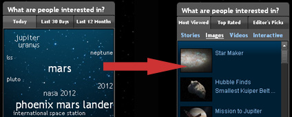
There’s a part of the homepage that very few users were looking at. If you went to the homepage, I’d bet that you missed it several times over the last several years. Most of our visitors do. It was a little graphic in the right hand column about two-thirds of the way down the page. And for the last four months or so, it has said “2012” in really big digits in four different places.
And now it’s gone.
We’re talking about the “tag cloud” that appeared under the “What are people interested in?” area in the right hand column of the page. It was that nebulous-looking area on the homepage that showed you the popular search terms from the past day, week, and month in different font sizes depending upon their popularity. And the reality of it was that it was a cool feature to look at in 2007 when we launched the current design of the site, but it wasn’t a very useful tool for our actual audience.
However, the concept of sharing what are people interested in is still very, very useful. You’ll find it on some of the best Web sites out there. On CNN.com, they have “NewsPulse.” On the New York Times web site, they have the “Most Popular” section. And it’s on countless other sites.
So taking some of the standard-bearers’ approaches and putting a NASA twist on them, we reinvented that box to hopefully provide a ton of more useful information. We ended up giving it a multi-layered tab approach with three areas of interest:
- A “Most Viewed” tab that looks at the top stories, images, videos and interactive features in separate lists.
- A “Top Rated” tab shows the top user-rated pages on the site for the last week.
- And an “Editor’s Picks” tab that showcases links selected by the Web site staff based upon popular pages that people often say are hard to find.

We hope that this provides more useful information to you than the previous ‘tag cloud.’ A more standard list of titles with links should already present a more intuitive interface compared to the different search words of smaller and larger font sizes. Let us know what you think of this. We hope it takes things from ‘cloudy’ to clear and useful.
Does it work better for you? Are there other hard-to-find links that we should work to put into the “Editor’s Pick” tab?
