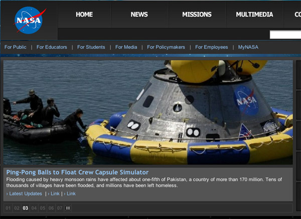
Back in January we changed how we presented the main news stories on NASA’s Home Page. Under the old treatment

News-feature treatment before January 2012.
some people said they could not find stories other than the top one, even though the stories cycled through the main slot. And with our upcoming events “ticker” above the image, it was easy to mistake that line for the headline, which was actually below the picture. Finally, we had had perpetual complaints about it being impossible to find older stories once they dropped off the main page.

So we changed to the current format, which has only one photo with nothing cycling. We pulled the headlines for other important stories up to the right of the main image, and visually separated the ticker from the main news box. We also added an archive to older stories.

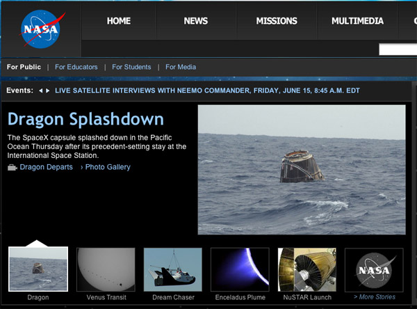
Proposed news-feature treatment.
There was no overwhelming reaction. Our customer-satisfaction survey showed the exact same ratings for overall satisfaction and look and feel for the three months before the switch and the five months since. The navigation rating dropped a single point.
Still there were some complaints, primarily about having only one image. People expected to have an image come up in relation to the secondary stories. We’ve tried to address that, and you can see the result on this mockup. Instead of headlines for other stories, you have thumbnails that link to them, with an additional link to the archive. In keeping with the original changes, nothing happens as you move your mouse. You have to click. When you do, the large thumbnail and text comes up for that story.
We’re interested in your feedback — please let us know what you think. And a heads up that we’ll be coming back to you within a month or so for your ideas on what the next major overhaul of www.NASA.gov should look like.
