Changing the site nav: it’s not (for) us, it’s (for) you

So, what did we learn from our navigation study? That even after more than a decade of trying to organize NASA’s website along lines that make sense to you, the public, we still do some things that make more sense to us. In trying to create a minimum of top-level nav categories, we grouped some things together in ways that confuse you.

All of this has given us good input for this second round of tests. Colleen Kaiser, our user experience engineer, has created two versions of a new test. You’re welcome to try  either or both. I won’t tip off the revisions we’ve made – go and see for yourself. Thanks again for helping us.

NASA Nav Test 2, Version A

NASA Nav Test 2, Version B

NASA: The People’s Choice

Webby Award Winner iconThank you.

It’s that simple. For the seventh time (and fifth in the last six years), you — the Internet public — have awarded NASA the Webby’s People’s Voice award for government websites. When the last results were published before voting closed, NASA’s site had 57 percent of the vote.

Though it has been nice to win the judges’ Webby in 2003 and 2012, it means more to the NASA web team to have won the People’s Voice Award in 2002, 2003, and from 2009 through 2012. We are grateful for the continued support you have given us, not just by voting for us but by visiting the site every day. More than a quarter of a million of you do. The NASA.gov team takes that as validation that we’re doing what we’re supposed to be doing: conveying the excitement of exploration to the public.

That takes a considerable team. Including infrastructure team members, more than 100 people work on www.NASA.gov. They sift through a considerable amount of content to bring you the best of what NASA does. Some days there’s so much going on that a story will make it to the front page in the morning and be forced off for newer, bigger stories before the end of the day.

I’d be remiss in not congratulating the other nominees: our federal colleagues at the National Oceanic and Atmospheric Administration and web teams from the city of New York, Sweden and Wales. NASA’s Jet Propulsion Laboratory was an honoree in the government category, and Space Center Houston, the private group affiliated with NASA’s Johnson Space Center, was a nominee in the science category.

And we’re not finished. As I’ve noted on the blog before, we headed into redesign that will address some of the problems people have (primarily visual clutter that makes navigation difficult) and turn www.NASA.gov into a responsive site that works much better on mobile devices. Stay tuned.

Help Test Navigation for the New NASA.gov

It doesn’t sound like much fun: take everything you’ve been doing at work and figure out an entirely new way of doing it. But it’s a fact of life on the Internet: technology changes so rapidly, driving equally rapid changes in how people use it, that as soon as you’ve brought everything up to date you start falling behind again. At NASA.gov, we enjoy that challenge.

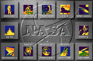
NASA.gov image map 1994
From 1994 through 1997, the NASA Home Page featured this image map as the primary navigation tool.

Which brings us to today’s topic: a new design for www.NASA.gov (the fourth major overhaul since I started managing the site in 1995) and how you can help us realize it. Since we last reworked the site in 2007, the digital world has changed radically. Social media effectively takes content off of websites and puts it wherever people are, quite often on mobile devices rather than computers. We need to adapt and update how we manage and present the site.

The new design will have five goals:

  • Address users’ pain points with current design
  • Modernize the look and feel
  • Be adaptive, so users on mobile devices have as good an experience as users on desktops or laptops.
  • Structure content so that other people and sites can reuse it.
  • Differentiate between dynamic content, like news and multimedia meant for the broad public, and more static content intended for smaller, more specialized audiences.

Each of these goals is worth a short blog post, which will come out in the next few weeks. For the time being, it’s back to first principles.  Before we do any design work, we need to establish the site’s organization. According to our customer-satisfaction data, the basic structure still works, but we’re going to have to present it a little differently to achieve our goals.

That’s where you come in. Through an online service called Treejack, we’ve set up a mock navigation structure and a set of tasks for you to try to accomplish using it. You point and click to tell us which navigation elements you’d use for each task. Based on what you do, we can see if we need to move things around or relabel categories to try to help you find things. There are no right or wrong answers; we’re testing the navigation, not you.

If you’d like to help, visit the NASA navigation exercise. It shouldn’t take more than 15 minutes, and you will not be asked to provide any personal information. Thanks for taking the time to make this site better.

NASA.gov Gets 2014 Webby Nomination

The NASA.gov team was very happy today to learn that the Agency’s website has been nominated for the sixth time for the Webby for government sites. It’s always an honor when any group compliments the site, but we get really pumped when it comes to the People’s Voice Award.

The Internet community has awarded us five People’s Voice Awards, including four in a row from 2009 to 2012. We take that as a significant endorsement that we’re running NASA.gov effectively for its primary audience – you, the public. We’ve got various metrics, including traffic and customer-satisfaction data, that tell us we are generally getting it right, but a direct vote of confidence like this is even better.

NASA.gov represents the work of dozens of people across NASA, including content editors, infrastructure vendors and staff from our CIO office, Communications and all NASA offices and centers. Together we are a 24/7/365 news operation working to bring you news on all of NASA’s programs whenever it happens.

2010 NASA webby
NASA’s 2010 People’s Voice Webby Award

(Don’t believe me? Join the Marshall Space Flight Center for its Up All Night chat on next week’s lunar eclipse. The chat room opens at 1:45 a.m. EDT on April 15.)

Now you have the opportunity to speak your mind again, by voting in the 2014 People’s Voice Awards.

(You will have to create a user account and presumably allow a cookie or other tracking technology to be used, as the Webby organizers are trying to prevent multiple votes from any account.) Once you’re signed in, you can search for NASA or find us under the Web > Government category.

NASA.gov is up against other worthy sites, of course, including our federal colleagues at NOAA for climate.gov. All of the nominated sites reflect a lot of hard work on someone’s part, so give them a look and cast your vote for the one you think best represents government on the web. And whether you vote for us or not, thank you for your support over the years.

Death Star Response Inspiring Future Explorers?

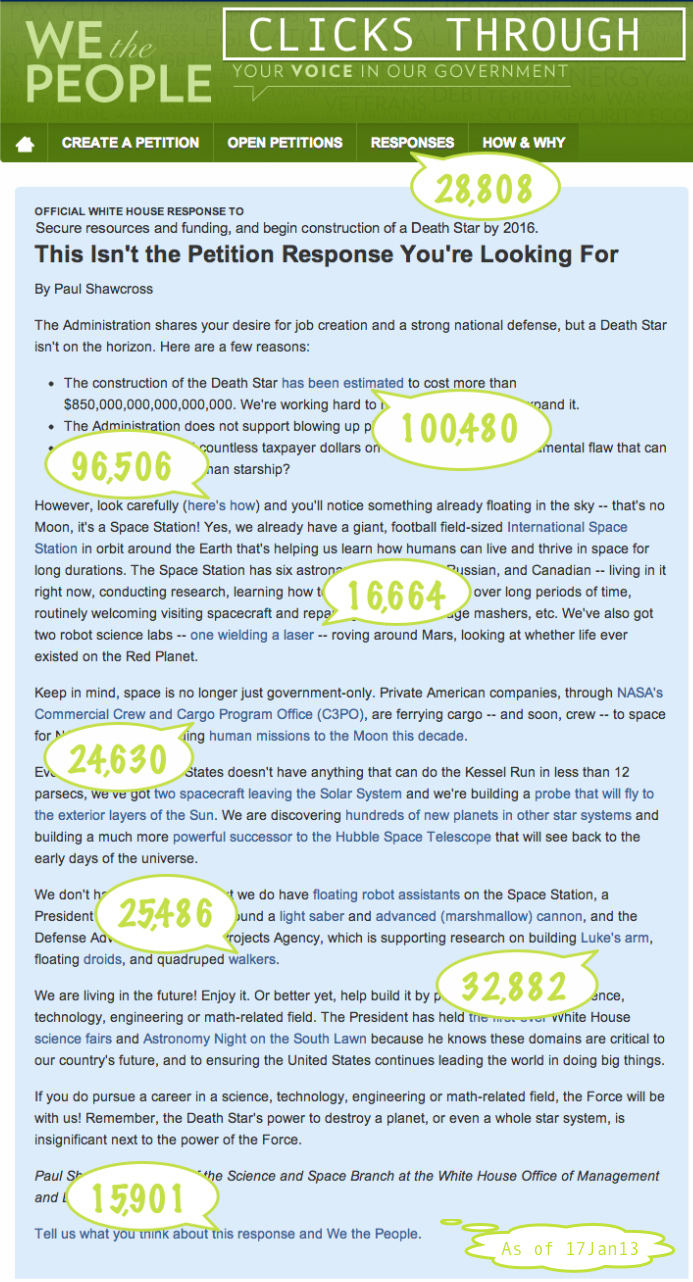
we the people Death Star petitionThe White House response to a petition on building a Death Star (and the resulting media attention) led to some pretty interesting data here at NASA.gov. While the petitioners wanted to focus on a big project done a long time ago in a galaxy far, far away, the response led to thousands of Americans finding out about projects NASA is currently working on right here on Earth and in our Solar System.

One example is a reference to NASA’s Spot the Station tool, which helps direct people to where and when to see the International Space Station in the night sky. Over 10,000 people signed up for the tool on Jan. 12, the day after the blog response was posted. Compared to similar periods, NASA saw a 1,400% increase in Spot the Station site usage.

Both NASA’s Mars Curiosity and International Space Station pages had their highest traffic days of the month on Jan. 12. Both saw a jump in page views between one and two times the monthly average.

The impact on NASA’s Commercial Crew and Cargo Program Office (C3PO) page was huge. Traffic to the site increased about 200x between Jan. 10 – 12. The traffic over that weekend represents more than half the traffic to that page for the entire month.

The White House response goes on to mention NASA’s Kepler mission, the Voyager mission, the Solar Probe Plus mission, the agency’s upcoming James Web Telescope, and the free-flying Synchronized Position Hold, Engage, Reorient, Experimental Satellites (SPHERES).

One major goal of NASA and the Administration is to encourage students to take interest in science, math, engineering and technology. Maybe the idea of a Death Star petition wasn’t so crazy. Maybe a few future explorers were inspired by some of NASA’s space missions.

And if Star Wars fans need something spacey to watch while waiting for Star Wars: Episode VII to arrive in theaters, why not tune into NASA’s YouTube Channel and see some of the amazing things being done by folks here on planet Earth.

Image Above: The White House response to the We The People “Death Star” petition, with click-throughs highlighted. View the full size image here.

What's Next for NASA.gov?

We’re starting on the next go-round of what NASA.gov looks like and want to know what you think.

The digital universe has changed radically since we overhauled www.NASA.gov in 2007. When we released that version (NASA.gov 5.0) we were most concerned with reorganizing our content so that it reflects how the general public sees NASA and its work, making things easier for people to find. (Your feedback said we largely succeeded, though with a site as complex as NASA’s it will never be perfect.) We also added blogs and the ability for users to rate and comment on our content.

The biggest change since then has obviously been the growth of social media. You’ve probably seen some of the numbers: NASA has 1.3 million Facebook likes and 3.1 million Twitter followers, and more than 280,000 people circle us on Google+. I was wondering if that would mean a drop in visitors to the site as people became content with the information they could get on social media. In fact, visits to the site dropped from 2008 to 2009 and again from 2009 to 2010.  Then we set a record with 150 million visits to the site in 2011 and already have 166 million this year. With four years of data, it’s now no surprise that they don’t correlate: while there’s some overlap between the two audiences, almost 70 percent of our site visitors aren’t really influenced by social media. 

Meantime, we’ve been trying to bring the conversation back to NASA.gov. Social media sites are great for flashing the latest news or multimedia item around the world, but the depth and context are here on the site. We want to make sure people know that they can always learn more about what they’re most interested in by coming to the site. 

We also want our regular visitors to know that there’s NASA content available off the site. We’ve embedded the @NASA Twitter feed in the home page so visitors can see the latest updates. We’re pushing streams of NASA TV to Ustream and videos to YouTube, and offering programming there that isn’t on NASA TV. We’ve covered recent news events by putting up a splash page that combines live NASA TV with Twitter feeds and active commenting.

Hand-in-hand with social media’s growth has been the public’s adoption of smartphones to access websites. We launched the mobile version of www.NASA.gov a couple of years ago and have watched its usage grow. We recently put it through some user testing and made some changes based on the results.

So — do you like something you’ve seen? Is something missing? How do you interact with NASA online? Where else do you get your NASA news from? We’re opening up an online forum at Ideascale to take your feedback. You can offer ideas of your own or comment and vote on others’ suggestions. You can post comments here. We’ll take all the data and do some prototyping, then see what you think.

Changes to Our News Section

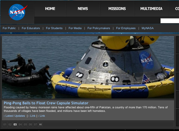
Back in January we changed how we presented the main news stories on NASA’s Home Page. Under the old treatment

image of www.nasa.gov news feature
News-feature treatment before January 2012.
some people said they could not find stories other than the top one, even though the stories cycled through the main slot. And with our upcoming events “ticker” above the image, it was easy to mistake that line for the headline, which was actually below the picture. Finally, we had had perpetual complaints about it being impossible to find older stories once they dropped off the main page.

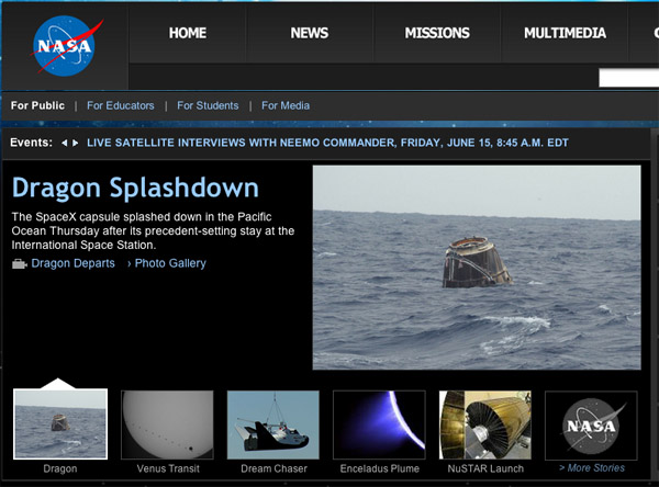
So we changed to the current format, which has only one photo with nothing cycling. We pulled the headlines for other important stories up to the right of the main image, and visually separated the ticker from the main news box. We also added an archive to older stories.
image of proposed news-feature treatment
Proposed news-feature treatment.
There was no overwhelming reaction. Our customer-satisfaction survey showed the exact same ratings for overall satisfaction and look and feel for the three months before the switch and the five months since. The navigation rating dropped a single point.
Still there were some complaints, primarily about having only one image. People expected to have an image come up in relation to the secondary stories. We’ve tried to address that, and you can see the result on this mockup. Instead of headlines for other stories, you have thumbnails that link to them, with an additional link to the archive. In keeping with the original changes, nothing happens as you move your mouse. You have to click. When you do, the large thumbnail and text comes up for that story.
We’re interested in your feedback — please let us know what you think. And a heads up that we’ll be coming back to you within a month or so for your ideas on what the next major overhaul of www.NASA.gov should look like.

What Does 'Content As Data' Mean, Anyway?

Editor’s Note: Jim Wilson is Senior Producer of www.nasa.gov and served on detail as project manager for the .Gov Reform Task Force, which helped develop the Digital Government Strategy.

The newly released Digital Government Strategy calls for a fundamental shift in how government treats digital information, taking an information-centric approach and treating all content as data. But what exactly does “content as data” mean?

Many of us probably hear the word “data” and think of a long list of facts and figures or maybe that android guy from “Star Trek.” But here we’re talking about “structured data,” which is just a fancy way of saying we build our content so that it can be read by machines as well as humans. If you’ve ever subscribed to a podcast or an RSS news feed, you were using this idea.

So what would this look like, and how could it help the government reach citizens? Well, we already know, because we’re already doing it.

Here at NASA, we consume a lot of our own data. This means that we structure things like press releases, images and videos so they can be syndicated across the site and subscribed to by users. Our entire collection of videos on www.nasa.gov/video  is presented this way. Anytime a new video is published, it gets added to the appropriate feed, which automatically get pulled into the appropriate pages, without having to manually add to pages and publish multiple times.
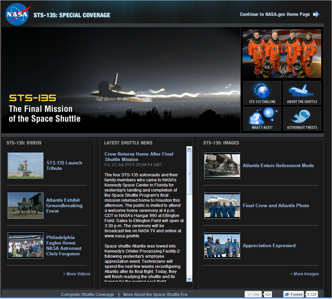
Shuttle page using data feeds

NASA.gov homepage using dynamic feeds to provide updates on STS-135 mission. 

Our most high-profile use of this technique came during the final flight of the space shuttle in July 2011, when we set up a special version of the NASA.gov homepage with multiple data feeds from around the country. At any given time, users could see a real-time text stream of mission updates, as well as the latest videos and photos from the mission. This information could be updated from multiple sources in Florida, Texas, Washington, DC and elsewhere. And the homepage itself rarely had to be touched. Simply by setting up the feeds, NASA let all the data flow into a single, easily accessible place. The page was tweeted more than 8.000 times and got more than 42,000 likes on Facebook.

Another example of this approach is the “create once, publish everywhere” mindset used by the Centers for Disease Control and Prevention to liberate its content from presentation. In other words, you don’t have to go to their webpage and look at the information in their look-and-feel. You can get the information directly from them in lots of different places, on your terms.

So how does that work?

CDC’s content is structured in tagged so that it can be syndicated and consumed both within the agency and externally. Within its own channels, content is updated once then easily displayed on the main CDC.gov web site, the mobile site at m.cdc.gov, and in the various modules of the CDC mobile app. In 2011, CDC’s liberated content was syndicated to 700 registered partners in all 50 US states, the District of Columbia and 15 countries and accounted for an additional 1.2 million page views.

Opening government information in this way has huge potential. Citizens can take content and mash it up to fit their unique needs, while private sector firms can develop government data-driven apps that the government couldn’t build on its own.

We want our users to get the content however they want. If it’s good for them to come to our site, great. But if they can get the information they need some other way, just as great. Our mission, after all, isn’t driving up page views to our homepage; it’s providing the best digital information and services to citizens.


NASA.gov and Social Media: Where Do They Meet?

We released our last redesign in 2007. Since then social media have exploded and changed how people get information online. Social media have also raised the question of whether its participants are using their newer tools more exclusively, or are they still visiting existing web sites.

One of the questions we ask in our customer-satisfaction survey is how frequently a visitor accesses certain kinds of content or engages in particular activities. They respond on a scale of 1 (never) to 5 (always). Here are the results for 2011, with each activity, followed by the percentage of people who answered 3, 4, or 5 (in other words, with some frequency), and then the percentage of people who answered 1 (never).

Images: 86%, 4%
Feature stories & news updates: 81%, 6%
Video Features: 70%, 10%
NASA TV streaming: 48%, 28%
Interactive Features: 48%, 23%
NASA calendar: 45%, 27%
Bookmark or tag pages: 32%, 43%
e-Mail updates: 28%, 57%
Read blogs: 26%, 47%
Use social networks to find out about NASA: 22%, 65%
myNASA: 27%, 53%
Podcasts: 20%, 57%
Add comments, ratings or reviews: 19%, 60%


No surprises at the top. Images and video have been the most popular elements on the site since I started editing it in 1995. The most interesting thing to me is that 2/3 of respondents say they don’t use social media to find out about NASA. We have a related question asking people what other tools besides NASA.gov do they use to find out about NASA. The responses:
  
  Watch NASA video on YouTube: 37%  
Visit newsmedia sites like cnn.com: 27%  
  Other: 20%  
  Participate in online communities like Facebook regarding NASA missions: 12%  
  Read blogs: 9%  
  Follow NASA Twitter feeds: 9%  
  RSS feeds: 5%  
  None: 5%  
  SMS/Texting: 1%  

Taken together, the two questions suggest that NASA’s web audience and social-media audiences are still distinct, only overlapping a small amount. As we move forward into the next version of NASA.gov, which we hope to start working on in the next few weeks, we’ll need to keep this in mind. We want to integrate more social media into the web site, but we can’t move totally in that direction because there’s still a large part of audience that hasn’t done so at all.

Please offer any feedback you’d like to in the comments section.

NASA TV: Live in the Palm of your Hand

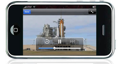
Over the last few weeks, we’ve set up and begun doing a beta test broadcast of NASA TV onto your Apple iPhone, iPad, and iPod Touch. We tweeted it out early yesterday to our Twitter followers before the landing of the Space Shuttle Atlantis once we were sure it was ready to have more of a spotlight shone on it. It’s also been linked on the NASA TV web page in the left column for the last couple of weeks since we set up the stream.

NASA TV on the iPhone
Watch the Stream Now

This specially formatted HTML5, H.264 stream was set up to test out new streaming technologies within the NASA network infrastructure and to demonstrate the technology as practical given the resources available for NASA.gov. During the beta period, we’re trying to identify issues and concerns with the reliability and delivery of the stream to you, our users. We’re also trying to gauge the interest of our online audience in having NASA TV available for streaming on the iPhone and other mobile devices.

For now, this is just the first step. If everything goes well during the beta test period, we’ll evaluate our next steps taking into account the availability of our limited resources. For the immediate future, this is an open ended beta test period. We are listening for feedback on the quality, reliability, and availability of the NASA TV stream. We’re also listening for ideas of what you think the next steps should be. Some of the ideas we’ve most often heard are integration of NASA TV into the NASA iPhone App, mobile apps for other devices such as Android and Blackberry, and streaming NASA TV onto other devices. We’ve purchased the hardware that will allow us to do some of these ideas and expect to begin more streaming this summer.

As always, you can e-mail the NASA.gov Web Team at webcomments@hq.nasa.gov or drop us a line in the comments. We also monitor tweets sent to @NASA. We’ll try to respond as time allows, but know that we read every comment, e-mail, and tweet sent our way.