Palmdale Polarized

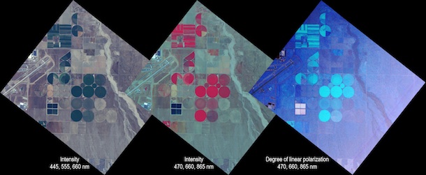
The brightness, or “intensity,” and polarization of reflected light provide different information about the elements that make up a scene, apparent in this set of images collected by the Airborne Multiangle SpectroPolarimetric Imager (AirMSPI) during its maiden flight on Oct. 7, 2010, on the ER-2 over Palmdale, Calif. AirMSPI is one of three prototype polarimeters being tested this month during the Polarimeter Definition Experiment (PODEX).

At left is a “natural color” intensity image created by combining information from the blue (445 nm wavelength), green (555 nm), and red (660 nm) spectral bands. The Palmdale airport, where the NASA ER-2 is based, is visible at left. Square and circular agricultural fields are also apparent.

The middle image also displays intensity, but was created by combining data from the 470, 660, and 865 nm bands. The latter is at a wavelength in the near-infrared, beyond the spectral range that the human eye can see. Because the data in this band are displayed in red, the agricultural fields show up as bright red because vegetation has high reflectance at this wavelength.

The right-hand image uses this same set of spectral bands as the middle picture, but the quantity displayed is the “degree of linear polarization,” or DOLP. When light is unpolarized, the plane of vibration of the light waves is randomly distributed. For completely linearly polarized light, there is a single preferred plane in which the light waves vibrate. In general, light is a mixture of unpolarized and polarized radiation, and DOLP is the proportion of the mixture comprised of polarized light.

The most highly polarized features in the DOLP image are the four square objects below and left of center; these are wastewater treatment ponds associated with the Palmdale Water Reclamation Plant. Although incoming sunlight is unpolarized, reflection by water polarizes the light, which is why polarized sunglasses are useful in reducing glare due to sunglint. The vegetated fields are also somewhat polarizing, because a portion of the light is reflected from the waxy layer at the surface of the leaves. The remainder of the light penetrates into the leaves and is absorbed by pigments such as chlorophyll before escaping, resulting in the green color of the vegetation in the natural color intensity image.

Image Credit: JPL/Caltech, AirMSPI Team

Text is by David Diner of NASA’s Jet Propulsion Laboratory in Pasadena, Calif. Diner is principal investigator of the Airborne Multiangle SpectroPolarimetric Imager (AirMSPI)

2012 Antarctic Ozone Hole Update

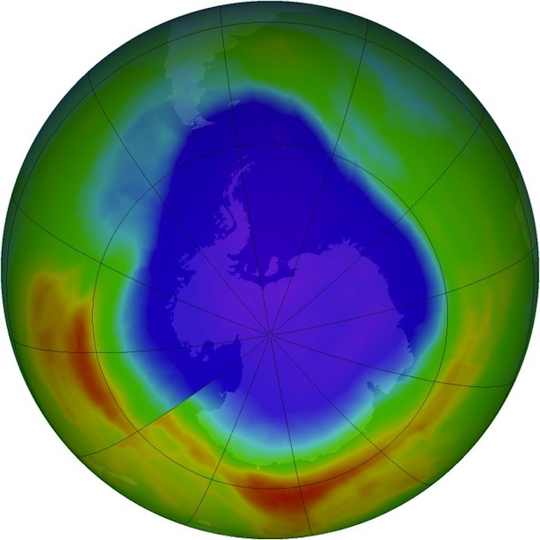
NASA and NOAA announced today that the hole in the ozone layer over Antarctica reached its annual maximum size on Sept. 22. Highlights include:

  • The Antarctic ozone hole reached its annual maximum size on Sept. 22, covering 8.2 million square miles — the area of the United States, Canada and Mexico combined.
  • That’s smaller than the record maximum of 11.5 million square miles reached on Sept. 6, 2000, and also smaller than last year’s maximum size of 10.1 million square miles.
  • Scientists attribute the smaller ozone hole in 2012 to warmer temperatures in the Antarctic lower stratosphere.

“The ozone hole mainly is caused by chlorine from human-produced chemicals, and these chlorine levels are still sizable in the Antarctic stratosphere,” said NASA atmospheric scientist Paul Newman of NASA’s Goddard Space Flight Center in Greenbelt, Md. “Natural fluctuations in weather patterns resulted in warmer stratospheric temperatures this year. These temperatures led to a smaller ozone hole.”

Read the full story here. Also read about the history of the ozone hole and its path toward recovery, and then check out the satellite-based image that in 1985 revealed for the first time the size and magnitude of the ozone hole. Finally, visit NASA’s Ozone Hole Watch to follow the state of the Antarctic ozone hole throughout the year.

The New Climate Dice

During the extreme heat waves and droughts of the early 1980s, climatologist James Hansen noticed coincident public discussions about the possible link of extreme events to climate change. He says discussion cooled, however, when natural variability turned up a season with average or cold temperatures. In 1988, another heat wave and drought wiped out crops in the U.S. Midwest, and resulted in more than 5,000 deaths, according to NOAA’s National Climatic Data Center. That same year, Hansen introduced the analogy of loaded dice to demonstrate variability and the growing frequency of extreme temperature events.

On one of the six-sided dice, Hansen painted two sides blue, two sides white, and two sides red to represent the chance of a cold, average, or warm summer season, respectively. That’s how the dice would have rolled from 1951 to 1980, when climate was relatively stable. On the other die – this one loaded – Hansen painted one side blue, one side white, and four sides red. That’s how climate models suggested the dice would roll by the first decade of the 21st century, should the increase of greenhouse gases in the atmosphere play out as it did.

“If you keep track for several seasons you notice the frequency of the anomalies has now changed, and you’re getting much more of those on the warm side than on the cool side,” Hansen says.

The changes that Hansen and colleagues calculated in 1988 turned out to be close to reality, as far as how many sides of the dice would now be red as opposed to blue to represent today’s climate. But a key difference between the 1988 dice and the new climate dice is the addition of an entirely new color. Almost one full side previously red is now brown, representing a new category of extreme hot events.

“I didn’t think about adding another color in 1988,” Hansen says. “Since then I have realized that the extreme cases are the most interesting and hold the most potential for impact, such as we’re seeing this summer in the case of the drought and devastated corn crop.”

The division between warm and cool will continue to change in the future, Hansen says. “But it’s still a crapshoot and you shouldn’t take one cool season as an indication that there’s something wrong with our understanding of global temperature and warming.”

Hansen and colleagues continue to use the dice for communication purposes, but they now employ a different statistical tool – the bell curve – that they say better demonstrates the change in temperature anomalies, particularly at the extremes.

Text by Kathryn Hansen. Top image: James Hansen of NASA’s Goddard Institute for Space Studies. Credit: NASA

Rain in Maine to Blame for Altering Gulf's Food Web


Changes in rainfall affect more than just land-based ecosystems. New research shows that increased rainfall in Maine led to the decline of ocean dwelling plant-like organisms called phytoplankton, which make up the base of the oceanic food web.

Researchers led by William Balch, of Bigelow Laboratory for Ocean Sciences in East Boothbay, Maine, found that more rainfall translates into more river runoff flowing into the Gulf of Maine. The runoff, in turn, prevents phytoplankton from receiving the nutrients and light they need to thrive, researchers reported March 29 in Marine Ecology Progress Series. Read the study here, and Bigelow Laboratory’s story here.

“We demonstrated a massive, five-fold drop in primary production in this region — along with other big changes — associated with the record-breaking precipitation events that started in the mid-2000’s,” Balch said.

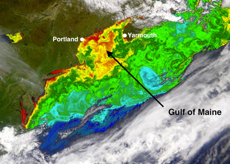
The researchers combined climate and river flow data with the results from a 12-year time series collected during the NASA-funded Gulf of Maine North Atlantic Time Series (GNATS) project. Between 1998 and 2010, GNATS documented changes in nutrient concentrations, phytoplankton biomass, and carbon fixation between Portland, Maine and Yarmouth, Nova Scotia (see map, below).

“We combined climate data from over a century, river run-off data and the coastal time series to show how intimately the coastal ecosystem is connected to hydrological processes on land,” Balch said.

It remains to be seen how the shift in the base of the food web will trickle up to impact the Gulf of Maine’s fish, lobster, and the endangered North Atlantic right whale, which has been known to feed in the Gulf.


Text by Kathryn Hansen. Top image: William Balch collects temperature measurements from the Gulf of Maine. Credit: Globe Staff / Dina Rudick. For related images, check out The Boston Globe’s “Climate Change in the Ocean” gallery.

Bottom image: Data from NASA’s Sea-viewing Wide Field-of-view Sensor shows areas in the Gulf of Maine that on May 11, 2002, exhibited the high chlorophyll concentrations (red and orange) that mark thriving phytoplankton populations. New research shows that increased rainfall and river runoff caused phytoplankton to decrease five-fold since the mid-2000s. Credit: NASA

Gavin Schmidt Named EarthSky Communicator of the Year

EarthSky has named Gavin Schmidt, a climate modeler based at NASA’s Goddard Institute for Space Studies its science communicator of the year. The first question of an eight minute EarthSky podcast Q & A with Schmidt is below. Listen to the rest of the interview here and see more of Gavin’s appearances in the media here

Give us a sense of what’s really happening with climate change on our planet right now.
I think you want to side-step that question and talk about whatpeople are doing to study this problem. Who are these people who aregoing out and measuring ocean temperatures? Who are these people who aretracking the year-on-year retreat of the Arctic sea ice? Who are thesepeople who are going out and measuring the small processes involved incloud formation, in soil moisture retention, in ocean eddies, inevaporation? It’s these things that we then put together to build thenumerical simulations that I work on, these climate models, that we’reusing to help us piece together what’s happened in the past, what’shappening now, and what’s likely to happen in the future. I think it’s far more important that people get a sense of thescience as a work in progress, rather than one particular message orpiece of content knowledge getting hammered home.

See How a Stronger Arctic Oscillation Has Shifted the Flow of Russian Runoff


An interesting new study published in Nature points out that an increase in the strength of the Arctic Oscillation between 2005 and 2008 caused winds in the region to grow more cyclonic and shift ocean currents in ways that drew more upper-surface freshwater from Russian rivers toward the Canada Basin and the Beaufort Sea. To see the shift in the animation above, look for the tightening of the wind patterns (shown in blue) over the Canada Basin that begins about 13 seconds into the video. Notice how the stream of less salty water from river runoff in Russia (shown in red) begins to loop westward toward Canada in sync with the circulation of the wind rather than continuing toward Greenland as it typically would. The purple arrows show the transpolar drift, a current that generally pushes water toward Greenland. NASA’s Jet Propulsion Laboratory has a press release with more details, and a number of news outlets have written stories about the study. In the image below, the altered path of the freshwater current is shown in red.

Air Pollution Helps Fuel Hailstorms, Tornadoes


I’ve written previously
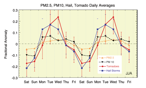
about research conducted by Thomas Bell, a scientist based at NASA’s Goddard Space Flight Center, that shows lightning storms tend to occur during the middle of the week when air pollution levels are the highest. An update: Bell has recently published more research showing the effect extends to hail storms and tornadoes as well. Here’s how Bell summarizes his latest work in a short write-up posted on a page from Goddard’s atmospheric science branch. For a more detailed explanation of how air pollution can fuel hail and tornadoes, you can read the full scientific paper (pdf) published by the Journal of Geophysical Research.

Hailstorm and tornado activity increases in the middle of the work week (Tuesday-Thursday) compared to weekends. Weekly cycles in weather behavior are a clear sign of human influence on our climate. The weekly cycle is believed to be caused by the well-known weekly changes in pollution levels with the day of the week. Aerosol pollution decreases the size of water droplets coalescing in clouds. They are lighter and don’t fall out as rain, but instead rise to much higher altitudes where they freeze and release additional heat. This invigorates the storm and produces more ice aloft. This might explain the increase in hailstorms as well as the increase in lightning that has also been observed. It is conjectured by Rosenfeld and Bell, based on numerical model simulations, that storms, amped up by pollution, nevertheless produce weaker cold pools at their base. Tornadoes develop less easily when a cold, rapidly moving pool forms beneath the storm. By weakening cold pool formation, pollution may lead to storms with better chances of forming a tornado than is the case for storms formed in clean air.


Text by Adam Voiland. Video showing lightning storms from the perspective of the International Space Station was posted originally on Johnson Space Center’s Crew Earth Observations Office website. Graphic comparing pollution levels, hail, and tornadoes from Bell’s 2011 JGR paper.

AGU2011: Dust Storm Triggered Phytoplankton Blooms in the South China Sea


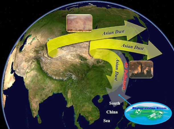
Between March 19th and 21st, an unusually strong storm in the Gobi Desert sent a large cloud of dust and pollution toward the Pacific Ocean.  Most of it went east toward Japan, but plumes of particles also made their way south toward Taiwan and the South China Sea. NASA satellites orbiting overhead observed the dust moving south, and for a period of eight hours on March 21 a mobile laboratory managed by scientists from NASA’s Goddard Space Flight Center on the Dongsha Islands observed the dust storm and recorded a dramatic spike (top graph below) in particle mass, as well as counts.

Months later, an analysis conducted by scientists atNASA’s Goddard Space Flight Center including Si-Chee Tsay andSheng-Hsiang Wang showed that over the next ten days following thearrival of the dust, satellite instruments on Aqua and SeaWiFS detecteda marked jumped in phytoplankton abundance (shown by the green circle in the chart above). That’s notable because the nutrient-limited ocean water in the area isn’t known to support much life.


The key ingredient that triggered the bloom, the scientists believe, was iron and phosphorus within the dust particles. Many types of phytoplankton require trace amounts of key nutrients to thrive and blooms can’t easily occur when levels are low, as they are in the northern South China Sea. Satellites have observed dust plumes triggering phytoplankton blooms in the past, but this is the first time the phenomenon has been observed in the South China Sea, an area where heavy dust deposition is relatively infrequent.

Text by Adam Voiland. Top and middles figures courtesy of Sheng-Hsiang Wang. Phytoplankton illustration and Gulf of Tonkin phytoplankton bloom originally published by NASA’s Earth Observatory. The phytoplankton bloom shown is from 2008 and not the bloom discussed in this blog post. Si-Chee Tsay presented a poster on this topic at the American Geophysical fall meeting on Dec. 6, 2011.

AGU 2011: Less Snow Accumulating in West Antarctica


To understand how the Antarctic ice sheet is going to behave in the future, scientists first need to know how much snow and ice is in there. And a major step in determining that figure is calculating how much snow accumulates each year on the frozen continent.

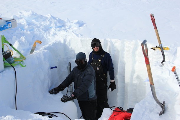
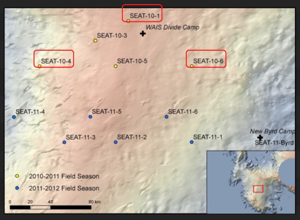
Researchers from the Satellite Era Accumulation Traverse (SEAT) are extracting ice cores in central West Antarctica to update snow accumulation records, since the majority of previously collected cores only extend to the mid-1990s. The scientists analyzed three of the five cores collected during their 2010-2011 field campaign, and their preliminary results show that snow accumulation has decreased significantly (up to 40 percent) across central West Antarctica during the last decade.

“This is the opposite of what you’d expect at a time when there’s a significant warming of West Antarctica,” says Landon Burgener, of the SEAT team, who presented the group’s preliminary results at the American Geophysical Union’s Fall Meeting.

Higher temperatures mean higher water evaporation, which in theory should lead to more snowfall. The measured decrease in snow accumulation goes against the predictions of global climate models, so why is it happening? It might have to do with less frequent, weaker storms in the area, says Summer Rupper, one of the principal investigators of the SEAT project. Less storms means that the extra moisture in the atmosphere ends up falling back to Earth somewhere else, probably over the ocean. Next, the team will examine the (scarce) existing weather data for West Antarctica to see if it’s true that the area is becoming less stormy. Rupper also wants to use ground-based radar data to study how representative the cores are of the places where they were extracted.

Meanwhile, other members of the SEAT team are currently in Antarctica to collect eight more cores that they will analyze to see if they also show a decline in snow accumulation.


Text by Maria-José Viñas. Photo and map courtesy of the SEAT team: The photo (top) shows members of the team drilling an ice core during the 2010-2011 season; the map (above) shows the drilling sites in central West Antarctica. Follow the work of the SEAT researchers in Antarctica on their blog, Notes from the field.”