Palmdale Polarized

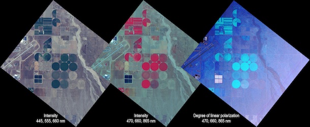
The brightness, or “intensity,” and polarization of reflected light provide different information about the elements that make up a scene, apparent in this set of images collected by the Airborne Multiangle SpectroPolarimetric Imager (AirMSPI) during its maiden flight on Oct. 7, 2010, on the ER-2 over Palmdale, Calif. AirMSPI is one of three prototype polarimeters being tested this month during the Polarimeter Definition Experiment (PODEX).

At left is a “natural color” intensity image created by combining information from the blue (445 nm wavelength), green (555 nm), and red (660 nm) spectral bands. The Palmdale airport, where the NASA ER-2 is based, is visible at left. Square and circular agricultural fields are also apparent.

The middle image also displays intensity, but was created by combining data from the 470, 660, and 865 nm bands. The latter is at a wavelength in the near-infrared, beyond the spectral range that the human eye can see. Because the data in this band are displayed in red, the agricultural fields show up as bright red because vegetation has high reflectance at this wavelength.

The right-hand image uses this same set of spectral bands as the middle picture, but the quantity displayed is the “degree of linear polarization,” or DOLP. When light is unpolarized, the plane of vibration of the light waves is randomly distributed. For completely linearly polarized light, there is a single preferred plane in which the light waves vibrate. In general, light is a mixture of unpolarized and polarized radiation, and DOLP is the proportion of the mixture comprised of polarized light.

The most highly polarized features in the DOLP image are the four square objects below and left of center; these are wastewater treatment ponds associated with the Palmdale Water Reclamation Plant. Although incoming sunlight is unpolarized, reflection by water polarizes the light, which is why polarized sunglasses are useful in reducing glare due to sunglint. The vegetated fields are also somewhat polarizing, because a portion of the light is reflected from the waxy layer at the surface of the leaves. The remainder of the light penetrates into the leaves and is absorbed by pigments such as chlorophyll before escaping, resulting in the green color of the vegetation in the natural color intensity image.

Image Credit: JPL/Caltech, AirMSPI Team

Text is by David Diner of NASA’s Jet Propulsion Laboratory in Pasadena, Calif. Diner is principal investigator of the Airborne Multiangle SpectroPolarimetric Imager (AirMSPI)

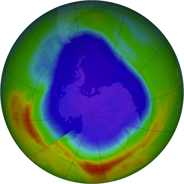
2012 Antarctic Ozone Hole Update

NASA and NOAA announced today that the hole in the ozone layer over Antarctica reached its annual maximum size on Sept. 22. Highlights include:

  • The Antarctic ozone hole reached its annual maximum size on Sept. 22, covering 8.2 million square miles — the area of the United States, Canada and Mexico combined.
  • That’s smaller than the record maximum of 11.5 million square miles reached on Sept. 6, 2000, and also smaller than last year’s maximum size of 10.1 million square miles.
  • Scientists attribute the smaller ozone hole in 2012 to warmer temperatures in the Antarctic lower stratosphere.

“The ozone hole mainly is caused by chlorine from human-produced chemicals, and these chlorine levels are still sizable in the Antarctic stratosphere,” said NASA atmospheric scientist Paul Newman of NASA’s Goddard Space Flight Center in Greenbelt, Md. “Natural fluctuations in weather patterns resulted in warmer stratospheric temperatures this year. These temperatures led to a smaller ozone hole.”

Read the full story here. Also read about the history of the ozone hole and its path toward recovery, and then check out the satellite-based image that in 1985 revealed for the first time the size and magnitude of the ozone hole. Finally, visit NASA’s Ozone Hole Watch to follow the state of the Antarctic ozone hole throughout the year.

The New Climate Dice

During the extreme heat waves and droughts of the early 1980s, climatologist James Hansen noticed coincident public discussions about the possible link of extreme events to climate change. He says discussion cooled, however, when natural variability turned up a season with average or cold temperatures. In 1988, another heat wave and drought wiped out crops in the U.S. Midwest, and resulted in more than 5,000 deaths, according to NOAA’s National Climatic Data Center. That same year, Hansen introduced the analogy of loaded dice to demonstrate variability and the growing frequency of extreme temperature events.

On one of the six-sided dice, Hansen painted two sides blue, two sides white, and two sides red to represent the chance of a cold, average, or warm summer season, respectively. That’s how the dice would have rolled from 1951 to 1980, when climate was relatively stable. On the other die – this one loaded – Hansen painted one side blue, one side white, and four sides red. That’s how climate models suggested the dice would roll by the first decade of the 21st century, should the increase of greenhouse gases in the atmosphere play out as it did.

“If you keep track for several seasons you notice the frequency of the anomalies has now changed, and you’re getting much more of those on the warm side than on the cool side,” Hansen says.

The changes that Hansen and colleagues calculated in 1988 turned out to be close to reality, as far as how many sides of the dice would now be red as opposed to blue to represent today’s climate. But a key difference between the 1988 dice and the new climate dice is the addition of an entirely new color. Almost one full side previously red is now brown, representing a new category of extreme hot events.

“I didn’t think about adding another color in 1988,” Hansen says. “Since then I have realized that the extreme cases are the most interesting and hold the most potential for impact, such as we’re seeing this summer in the case of the drought and devastated corn crop.”

The division between warm and cool will continue to change in the future, Hansen says. “But it’s still a crapshoot and you shouldn’t take one cool season as an indication that there’s something wrong with our understanding of global temperature and warming.”

Hansen and colleagues continue to use the dice for communication purposes, but they now employ a different statistical tool – the bell curve – that they say better demonstrates the change in temperature anomalies, particularly at the extremes.

Text by Kathryn Hansen. Top image: James Hansen of NASA’s Goddard Institute for Space Studies. Credit: NASA

Rain in Maine to Blame for Altering Gulf's Food Web


Changes in rainfall affect more than just land-based ecosystems. New research shows that increased rainfall in Maine led to the decline of ocean dwelling plant-like organisms called phytoplankton, which make up the base of the oceanic food web.

Researchers led by William Balch, of Bigelow Laboratory for Ocean Sciences in East Boothbay, Maine, found that more rainfall translates into more river runoff flowing into the Gulf of Maine. The runoff, in turn, prevents phytoplankton from receiving the nutrients and light they need to thrive, researchers reported March 29 in Marine Ecology Progress Series. Read the study here, and Bigelow Laboratory’s story here.

“We demonstrated a massive, five-fold drop in primary production in this region — along with other big changes — associated with the record-breaking precipitation events that started in the mid-2000’s,” Balch said.

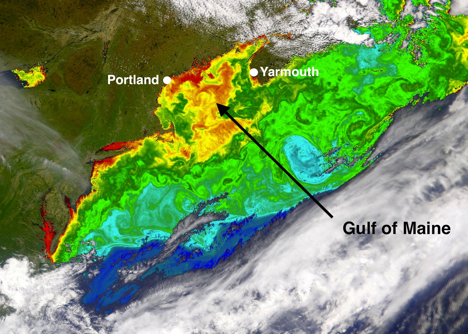
The researchers combined climate and river flow data with the results from a 12-year time series collected during the NASA-funded Gulf of Maine North Atlantic Time Series (GNATS) project. Between 1998 and 2010, GNATS documented changes in nutrient concentrations, phytoplankton biomass, and carbon fixation between Portland, Maine and Yarmouth, Nova Scotia (see map, below).

“We combined climate data from over a century, river run-off data and the coastal time series to show how intimately the coastal ecosystem is connected to hydrological processes on land,” Balch said.

It remains to be seen how the shift in the base of the food web will trickle up to impact the Gulf of Maine’s fish, lobster, and the endangered North Atlantic right whale, which has been known to feed in the Gulf.


Text by Kathryn Hansen. Top image: William Balch collects temperature measurements from the Gulf of Maine. Credit: Globe Staff / Dina Rudick. For related images, check out The Boston Globe’s “Climate Change in the Ocean” gallery.

Bottom image: Data from NASA’s Sea-viewing Wide Field-of-view Sensor shows areas in the Gulf of Maine that on May 11, 2002, exhibited the high chlorophyll concentrations (red and orange) that mark thriving phytoplankton populations. New research shows that increased rainfall and river runoff caused phytoplankton to decrease five-fold since the mid-2000s. Credit: NASA

Flying High with MABEL

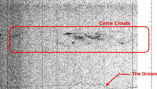
Scientists made a series of high-altitude flights this month from NASA’s Dryden Flight Research Center in Palmdale, Calif., demonstrating the scientific feasibility of surface elevation measurements to be made by one of the agency’s future Earth observing satellites, the Ice, Cloud and land Elevation Satellite-2 (ICESat-2). The first image (above) returned from a flight Dec. 8 clearly shows a layer of cirrus clouds and a high density of data points outlining surface elevation over California. Data in the image are preliminary and not for scientific use.

The data are from the Multiple Altimeter Beam Experimental Lidar (MABEL) instrument, assembled by a team led by ICESat-2 instrument scientist Matt McGill at NASA’s Goddard Space Flight Center in Greenbelt, Md.

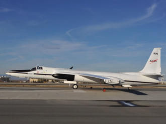
Tucked into the nose of the ER-2 aircraft (right) MABEL flew at an elevation of 65,000 feet (more than 12 miles) over five targets across the U.S. Southwest collecting surface elevation information similar to what will be collected by ICESat-2, scheduled for launch in January 2016.

“These were engineering test flights with intelligent science targets,” said Kelly Brunt, a polar scientist from Goddard who was in the field as a science liaison for flight planning. “We wanted to hit spectrum of targets that represent what the scientists are interested in, such as ocean water, fresh water, trees, snow, steep terrain and salt flats.

“The density of data collected is astounding, and will allow us to characterize what we see from space,” said Thorsten Markus, ICESat-2 project scientist and head of the Cryosphere Branch at Goddard.

To learn more, visit poster session C41A, “Measuring Earth’s Third Dimension: ICESat, IceBridge, CryoSat, and Beyond,” at 8 a.m. on Thursday, Dec. 16 at the 2010 AGU fall meeting in San Francisco, Calif.

–Kathryn Hansen, NASA’s Earth Science News Team

What On Earth (Sound) Was That #4? Seismic Music From Earth, Of Course…

Last week, we posted our first mystery sound in our latest installment of “What on Earth is That?”> We had some interesting guesses; one reader guessed the noisemaker was an earthquake and another guessed it was a calving ice. The answer is somewhere in the middle.

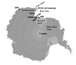
Giant icebergs may sink ships, but they also have their weaknesses. The sound you heard is the seismic signal recorded in October 2005 when a monstrous iceberg drifting off the coast of Antarctica’s Cape Adare crashed into the previously unknown Davey Shoal and broke apart. (Science News covered the collision in this July article.)  The full length of the audio file, sped up by a factor of 100, can be heard below. Within just 90 seconds, you can experience the full 2.5-hour event.

The “tap, tap, tap” is from cracks propagating through the massive chunk of ice. The effect is similar to what you hear if you drop ice cubes into a glass of water. The cracking noise crescendos until about 1:15, followed by a subtle hum resembling a muffled chain saw. That noise, from the phenomenon of ice pieces rubbing against each other, becomes most noticeable after the breakup. The same saw-like noise heard prior to 1:15 is thought to be the bottom of the berg rubbing on the shoal.

The audio comes from a study published June 18 in Journal of Geophysical Research. Looking at images from the Moderate Resolution Imaging Spectroradiometer on NASA’s Terra and Aqua satellites, the team noticed that between 1989 and 2005, at least three large bergs drifting off Cape Adare had suddenly stopped and broke apart. To discover the cause behind the bergs’ unusual behavior, the team turned to an iceberg called B15A.

Fortunately, plenty of information about the behemoth berg, which measured about 820 feet vertically and spanned some 75 miles by 19 miles, was available. Before the breakup, scientists had deployed an instrument package on B15A that included GPS and a seismometer. Later, a separate research group mapped the seafloor topography within the same area. “We knew from breakup that there ought to be something there,” said Seelye Martin, of University of Washington in Seattle, who led the study.
Overlaying the satellite images on the seafloor map, researchers recreated the series of events. On October 28, the berg hit the top of an underwater shoal 5.6 miles long and 705 feet below the surface at its highest point. The seismic information, heard in this post, matched the collision observed in the satellite imagery. Listening to the seismic music of the Earth is not new; geologists have long listened to the “rock music” of seismic waves from earthquakes. “But the iceberg has a very different signature,” Martin said. “Earthquakes sound like a big boom or slip, while in this case you can actually hear something breaking up.”

So what does it all mean? “It’s an interesting result, but it’s not a world changer,” Martin said. “We now know a little more about the obstacles — and sound — of some ill-fated icebergs leaving the Ross Sea.”

— Kathryn Hansen, NASA’s Earth Science News Team

Images and sound are courtesy of Seelye Martin, University of Washington

What on Earth is That? #2


(Please post your guesses and your name in the comments, and we’ll give the answer next week…)

Here at What on Earth, we’re constantly stumbling across interesting photos, videos, and audio clips from NASA’s exploration of our planet (be it from space, the field, or the lab.) Whether it’s a satellite montage captured from thousands of miles up, the roar of our B-200 research aircraft, or a microscopic view of a cloud droplet, there’s literally always something strange and wonderful passing across our desks.

To have a little fun (and spare all that fascinating stuff from the circular file), we’re going to post snippets of it every now and then, usually on Fridays. What we post will change, but the question to you all will always be the same: “What on Earth is that?”

Our only hints:

1) Our picks will always be related to Earth science in one way or another

2) It will have some relation to what we do at NASA.

We’ll give you a week to post your guesses, and we’ll post the answer the following Friday. In the meantime, check out the answer to What On Earth is That #1 here.  

What on Earth was That #2

Last week, we asked you to identify the flecks in a video posted to What on Earth is That #2, and we received all sorts of replies. The correct answer?

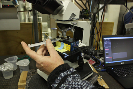
They may look like twinkling stars, but the shimmering flecks in this video are actually some of the tiniest particles in the ocean. This clip shows a complex mixture of the miniscule particles, both organic (living) and inorganic (nonliving) types. The large, fern-shaped specimen on the lower right is a type of phytoplankton. Some of the other flecks are likely bacteria and viruses.

Did you notice the slight vibrating motion that makes all the specks look like they’re flickering? That’s caused by random collisions with atoms, a phenomenon called “Brownian motion.” By measuring the distance each particle is pushed around, it’s even possible to infer particle size, which is important for understanding how the particles scatter sunlight in the ocean and for interpreting what ocean-observing satellites “see.”

Image and video Information: This sample was pulled from the Arctic’s Chukchi Sea on June 29, 2010, as part of NASA’s ICESCAPE mission. Kuba Tatarkiewicz, of the Scripps Institution of Oceanography, captured the action with a NanoSight instrument — a camera, microscope and viewing unit that the team adapted for use during the ICESCAPE oceanographic voyage.

-Kathryn Hansen, NASA’s Earth Science News Team

What's a Wallops?

What’s a Wallops?

The question, posed by an educated Virginia resident, illustrates a general unawareness that the state is home to one of the world’s oldest launch sites — NASA’s Wallops Flight Facility.

The facility, named after John Wallop who was granted the land in 1692, launched its first rocket on July 4, 1945 and has since launched more than 16,000 vehicles. Beyond launches, however, Wallops is home to other modes of space and Earth science, many of which were on display June 5 at an open house celebrating the center’s 65th anniversary.

Perhaps it’s the center’s location that keeps it hidden from the public eye. Nestled 200 miles away from urban areas, on Virginia’s eastern shore near Chincoteague Island, the coastline provides a prime location for launching suborbital and orbital rockets, targets for the military and testing unpiloted aerial vehicles. Being next to the ocean allows NASA to safely test unproven vehicles and also provides a location for conducting coastal Earth science studies.

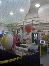
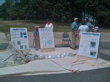
Wallops hosts a scientific balloon program, on display at the 65th open house. Adrift at high altitudes in Earth’s atmosphere, balloons carry instruments that measure emissions from space, contributing most to astrophysics research. Credit: NASA


Scientists and engineers at Wallops worked with the laser instrument on NASA’s Ice, Cloud, and land Elevation Sa
ESat)that measured the surface elevation of ice until fall 2009. The publiccould learn more about ICESat and plans for ICESat-2 during the openhouse. Credit: NASA


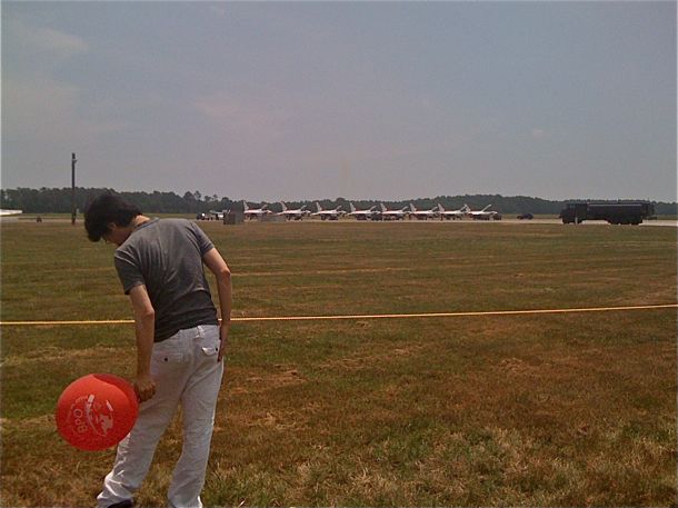
Perhaps the largest draw was the research airport. U.S. Air Force Thunderbirds lined up on the tarmac before taking off for a demonstration at an air show in Ocean City, Md. Credit: NASA

Wallops’ location also lends itself to Earth science research, described in the center’s roadmap as having “a focus on global climate change and the unique dynamics of the coastal zone environment.”

For example, scientists at Wallops have experimented with autonomous boats to study the ocean and atmosphere, and the interaction between the two environments.

From a distance, visitors saw a more science inclined aircraft, NASA’s very own P-3, just back from a mission in Greenland where it surveyed Arctic ice.

Missed the open house? Learn more about Wallops here.

— Kathryn Hansen, NASA’s Earth Science News Team

Jamboree and Jambalaya

The daily grind of a science and engineering career can leave little time to inquire how colleagues in the very next office have been spending their days and months. Toward remedying that, employees at NASA’s Goddard Space Flight Center emerged from their cubicles and offices on June 2 and mingled outdoors, Cajun style, at the center’s second annual Science Jamboree.
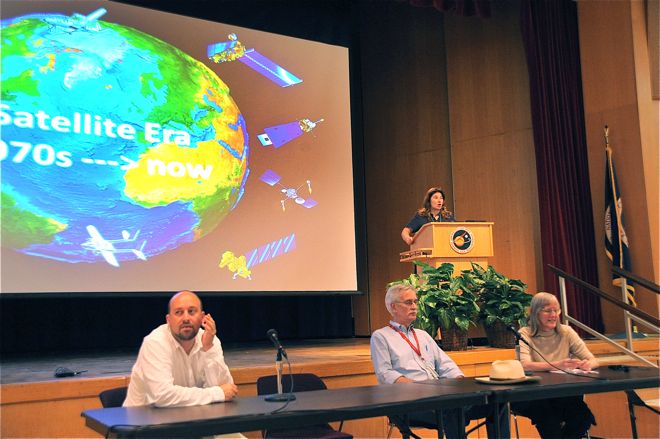
Congregating under tents on the Goddard campus lawn, everyone from scientists to secretaries and engineers to interns browsed the nearly 40 tables displaying the latest projects in earth science, astrophysics, heliophysics, and solar system science at the Mardi-Gras-themed event.

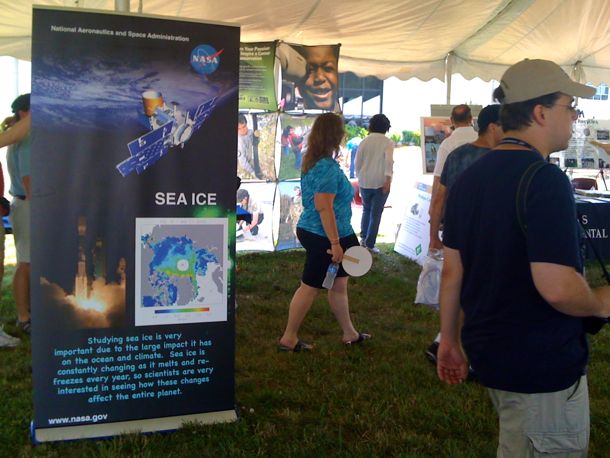
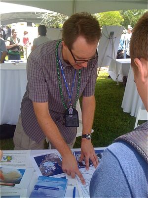
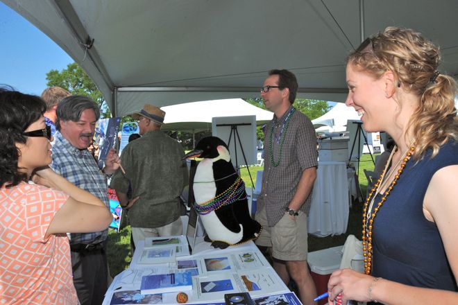
NASA scientists including Tom Neumann (right), described work by Goddard’s Cryosphere branch. Pointing to satellite data, he shows May 30, 2010, as having the lowest Arctic sea ice extent on that date since satellite measurements began in 1979. The data drew in people curious to know the state of Arctic ice. Credit: NASA/Kathryn Hansen

“The record is useful, but is there a benefit to predicting the Arctic sea ice extent just a month or so before it reaches its annual maximum?” said one earth scientist, sparking an in-depth discussion. Another visitor proclaimed, “I didn’t know NASA studies snow and ice.”

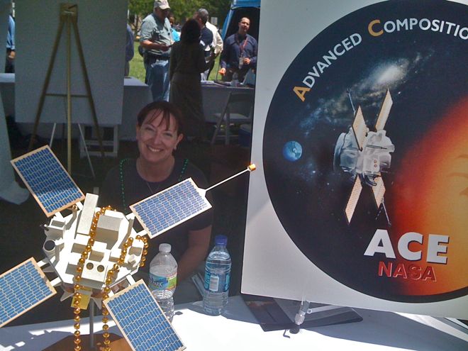
Other groups arrived with dramatic displays, from demonstrations of merging black holes — winning the “Most Visually Appealing Display” award — to mock ups of current satellite missions such as the Advanced Composition Explorer (ACE).

“ACE is still at it?” asked one visitor. The satellite is nearing its 13th year in orbit.

After snacking on jambalaya and wrestling crayfish from their shells, the crowd poured inside an auditorium for discussions of extreme space weather and of global climate change.


“Preparing for the panel presentation was certainly worth the effort,” said Goddard scientist Claire Parkinson (lower right), who spoke on the climate change panel with Compton Tucker (middle) and Gavin Schmidt (left). “We had a great turnout and the audience engaged us with thoughtful questions.” Credit: NASA/Debora Mccallum


A steady stream of spectators worked their way around the tables and posters describing current science projects. Credit: NASA/Debora Mccallum


NASA science writer Laura Layton spoke with audiences about projects within the heliophysics branch, including the ongoing Advanced Composition Explorer (ACE) satellite mission, which studies energetic particles from the solar wind. Credit: NASA/Kathryn Hansen

The Cryosphere branch showed off ice sheet and sea ice research, airborne studies and satellite missions. Credit: NASA/Debora Mccallum

— Kathryn Hansen, NASA’s Earth Science News Team