AGU2011: Dust Storm Triggered Phytoplankton Blooms in the South China Sea


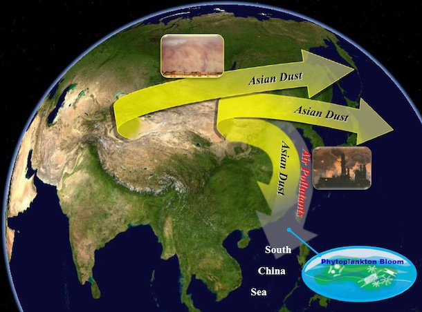
Between March 19th and 21st, an unusually strong storm in the Gobi Desert sent a large cloud of dust and pollution toward the Pacific Ocean.  Most of it went east toward Japan, but plumes of particles also made their way south toward Taiwan and the South China Sea. NASA satellites orbiting overhead observed the dust moving south, and for a period of eight hours on March 21 a mobile laboratory managed by scientists from NASA’s Goddard Space Flight Center on the Dongsha Islands observed the dust storm and recorded a dramatic spike (top graph below) in particle mass, as well as counts.

Months later, an analysis conducted by scientists atNASA’s Goddard Space Flight Center including Si-Chee Tsay andSheng-Hsiang Wang showed that over the next ten days following thearrival of the dust, satellite instruments on Aqua and SeaWiFS detecteda marked jumped in phytoplankton abundance (shown by the green circle in the chart above). That’s notable because the nutrient-limited ocean water in the area isn’t known to support much life.


The key ingredient that triggered the bloom, the scientists believe, was iron and phosphorus within the dust particles. Many types of phytoplankton require trace amounts of key nutrients to thrive and blooms can’t easily occur when levels are low, as they are in the northern South China Sea. Satellites have observed dust plumes triggering phytoplankton blooms in the past, but this is the first time the phenomenon has been observed in the South China Sea, an area where heavy dust deposition is relatively infrequent.

Text by Adam Voiland. Top and middles figures courtesy of Sheng-Hsiang Wang. Phytoplankton illustration and Gulf of Tonkin phytoplankton bloom originally published by NASA’s Earth Observatory. The phytoplankton bloom shown is from 2008 and not the bloom discussed in this blog post. Si-Chee Tsay presented a poster on this topic at the American Geophysical fall meeting on Dec. 6, 2011.

AGU 2011: New Map of Antarctica's Rock Bed

A new, updated map reveals how the Antarctic continent looks under the ice, detailing each mountain range and valley. Beyond its undeniable beauty, this high-resolution map of Antarctica’s bed topography, dubbed BEDMAP2, will help scientists model how ice sheets and glaciers respond to changes in the environment.

A large international consortium of Antarctic field programs, including NASA IceBridge, contributed information to this updated map of bed elevation and ice thickness for Antarctica and the Southern Ocean. The first version of BEDMAP was completed in 2000. The new version, which was presented on Dec. 5 at the American Geophysical Union’s 2011 Fall Meeting, incorporates seismic and radar data from about 265,000 km of airborne surveys over the ice.

“We are lacking fundamental data on ice thickness and bedrock elevation over large parts of Antarctica, because these areas are hard to reach,” said IceBridge project scientist Michael Studinger. “We’ll continue to fill in critical information gaps on places such as the Recovery Glacier in Coats Land, East Antarctica. This area has long been on the wish list of ice sheet modelers, but it is very far away from all research bases.”

This year, IceBridge’s DC-8 aircraft was able to fly four times over Recovery Glacier from Punta Arenas, Chile. “We have collected a landmark data set that will fill a critical hole in new BEDMAP compilations,” Studinger said.

Text by Maria-José Viñas. Image courtesy of the BEDMAP Consortium. The new version of BEDMAP will soon be freely available. Read more about the BEDMAP2 on the project’s website.

AGU2011: How Satellites Can Fill the Gaps in Air Quality Maps


You’ve most likely seen color-coded, real-time AIRNOW maps of air quality on the web or on television that show whether the air is safe, unhealthy, or hazardous. What you may not realize is that the network of ground-based instruments the EPA uses to make those maps has large gaps in some parts of the country, particularly in sparsely populated areas of the Great Plains and Intermountain West. (Red in the map above indicates areas without ground monitoring stations;  black dots show the locations of stations).


To address this problem, an effort sparked by recent advances in satellite measurements of air pollution seeks to integrate NASA and NOAA satellite measurements into the AIRNOW system. The accuracy of satellite measurements of air quality can vary depending on the weather, the topography, the brightness of the underlying surface and other factors, so the researchers leading the effort are developing a method that selectively incorporates only the reliable satellite data. The researchers are still refining the technique and the system isn’t yet operational, but preliminary case studies suggest the technique will be up and running by 2013.


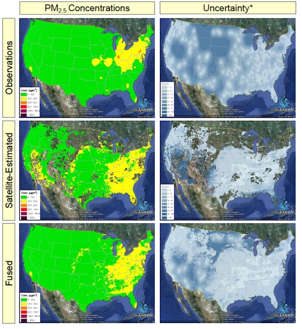
The figure above shows the technique researchers are developing tofuse ground observation and satellite observations of the small particles (PM2.5) that causes health problems. Groundobservations have high uncertainties (shown in the darkest blue) indifferent areas than the satellite observations. The right combinationof the two – see the fused maps at the bottom of the figure – will be more accurate  than either the ground network or satellite measurements alone.


Text by Adam Voiland. AdamPasch of Sonoma Technology presented a poster about this topic at theAmerican Geophysical Union fall meeting in San Francisco on Dec. 5, 2011. Video producedby Sonoma Technology. Imagery courtesy of Adam Pasch.

AGU2011: La Niña Responsible for a Significant Drop in Global Mean Sea Level


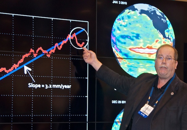
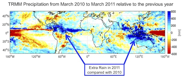
The 2011 La Niña, one of the strongest in recent decades, absorbed so much moisture from the oceans and dropped it as precipitation over northern parts of Australia and South America that global mean sea levels fell by about half a centimeter. That was the key point that Eric Lindstrom, an oceanographer based at NASA headquarters, made today while giving a presentation at NASA’s outreach booth at the American Geophysical Union’s fall meeting.
He gave the talk with the help of a sophisticated visualization system — called the Hyperwall — that’s capable of displaying large sets of data. The system consists of nine 42-50
flat-screen monitors arranged in a 3 X 3 array.

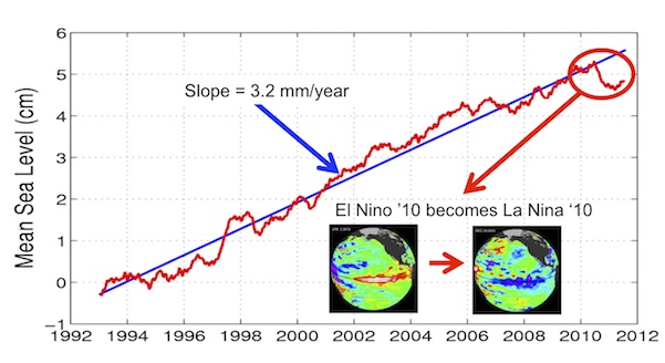
As Lindstrom pointed out, the fast transition from the 2009-10 El Niño to the 2010-11 La Niña triggered changes in precipitation patterns across the tropics, transferring enough water over land to cause global mean sea level to fall during the spring and summer of 2011. Data from NASA’s
GRACE and TRMM satellites have confirmed that the “extra” water and rain has ended up over land as freshwater (see below). The drop in sea level happened despite the background rate of global mean sea level rise, which has been fairly steady at 3.2 millimeters per year since the early 1990s.


At AGU? Be sure and check out the ongoing exhibit activities (pdf) and full schedule of hyperwall presentations (pdf)  at NASA’s exhibit (#1637). All the figures shown in this post are available in the Dynamic Oceans presentation on the Earth Observing System’s Hyperwall page. Blog text by Heather Hyre. Photo by Winnie Humberson.

AGU2011: New Project Aims to Predict South Asian Floods

What’s happening to Himalayan glaciers, rivers, lakes, and streams has become one of the most important – and widely debated – topics in science.

There’s certainly no shortage of questions. Which of the 15,000 glaciers in the region are retreating and which growing? How many glacial lakes are on the verge of bursting their banks and flooding downstream communities? Will the region’s great rivers, such as the Indus and the Ganges, be able to withstand the region’s changing climate and rapid population growth and continue to sustain the hundreds of millions of people who depend on them? How can devastating floods, such as the one that struck Pakistan last year, be avoided?

Firm answers to such questions have been hard to come by in recent decades because of the limited monitoring resources available in many key countries in the region. Now, however, a new effort, dubbed HIMLA and led by Molly Brown of NASA’s Goddard Space Flight Center, aims to change this by harnessing state-of-the-art, satellite-based monitoring and modeling techniques.

As part of the effort, scientists will feed data from satellite instruments such as MODIS and ASTER into a hydrological model that will produce daily snow/water equivalence maps that will feed into other hydrological models to determine how much freshwater flows into the region’s rivers from snow and glaciers. The ultimate goal: an early warning system that, like the Famine Early Warning System Network does for drought, will help predict floods before they happen.

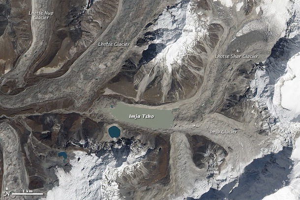
Text by Adam Voiland. Molly Brown spoke about the topic  at an American Geophysical Union Meeting on Dec. 6, 2011. Pakistan flooding photograph (top) ©2010 Tariq Saeed/IRIN. Image of Imja Tsho (bottom), one of the world’s fastest growing glacial lakes, originally published by NASA’s Earth Observatory.

AGU2011: How Shifting Storm Tracks Are Amplifying Climate Change


Tropical cyclones and hurricanes generate the most headlines, but it’s mid-latitude storms churning through heavily populated parts of North America, Europe, and Asia that make the weather most of us actually experience.

Climate models predict that these mid-latitude storms should shift poleward and that the intensity and frequency of the storms could change as global temperatures rise, but actual evidence of such a shift has been difficult to pin down. However, a recently published analysis of 25 years of cloud data captured by satellites offers a compelling piece of evidence that suggests storm tracks are indeed shifting.

The research, led by (former) Scripps Institute of Oceanography scientist Frida Bender, shows that storms tracks have shifted poleward, narrowed, and grown less cloudy since 1983, particularly in the Southern Hemisphere. The analysis, based on data from the International Satellite Cloud Climatology Project, finds that storm tracks have shifted by about 0.4 degrees over the last 25 years.

What’s more, the analysis suggests that changes in the location and intensity of storms could amplify global warming. The researchers detected what amounts to a 2 percent decline in storm tracks over the 25 year record. The decline in cloudiness is of particular importance because it suggests that intensity of storms is likely decreasing. And since clouds reflect large amounts of sunlight, reduced cloudiness means that ocean surfaces beneath storm systems are likely growing warmer.

Graeme Stephens, the director of NASA’s Center for Climate Science at the Jet Propulsion Laboratory, underscored the importance of the study in a piece published by Nature Climate Change noting:

Bender and colleagues’ study reminds us of the importance of changes in the large-scale clouds associated with frontal storms in storm-track regions. Not only do the polewards shifts in storm-track location profoundly affect precipitation patterns in mid-latitude regions, but associated changes in cloudiness also exert a significant positive feedback on global warming.

Text by Adam Voiland. Frida Bender presented a poster about the topic  at an American Geophysical Union Meeting on Dec. 6, 2011. The full paper is available here. Video of Midwest tropical storm originally published by NASA’s Earth Observatory. 

NASA's AVIRIS Instrument Highlighted During AGU Oil Spill Session

Some 25 billion tweets were sent in 2010, and surprisingly Lady Gaga didn’t dominate the list.  Instead, it was the summer’s Deepwater Horizon oil spill that inspired the most activity, according to data released by Twitter this week

Meanwhile, six months after the spill, and long after media and twitter chatter about it has subsided, scientists continue to parse out the details of the unprecedented event. I spent the afternoon yesterday in a session at AGU that highlighted the incredible array of resources the scientific community flung at the problem.

NASA is known best for its satellites (in this case, the iconic imagery of the spill captured by the MODIS instruments). Yet, as we’ve pointed out on this blog before, satellites aren’t the only tool that NASA’s earth scientists have at their disposal. In the midst of the oil spill crisis, NASA scrambled a number of aircraft bearing instruments that have a played key roles in sorting out the dynamics of the spill.

During the AGU session, Michael Freilich, director of NASA’s earth science division, emphasized the novel contributions of an airborne instrument called the Airborne Visible/Infrared Imaging Spectrometer (AVIRIS), a spectrometer that flew aboard the ER-2, a civilian version of the famous U-2 spy planes, and the Twin Otter, a much smaller propeller plan that flies at a lower altitude.

At AGU, Freilich outlined the AVIRIS contributions:

Flights were planned to do coastal ecosystem work because the hyperspectral measurements can be used to classify vegetation and to determine the impact of the oil on that vegetation, as well as to map the volume of the oil in the upper ocean over the oceanic portions of the slick. In a couple of weeks, AVIRIS flights took as much data as we usually take in an entire year or more. And whereas it usually takes two-to-three months for the AVIRIS data to be processed, calibrated, and distributed, the team working at Johnson, very early on, got it down to providing imagery and calibrated radiances to between 6 to 12 hours after a flight. Those measurements were then given to NOAA and USGS scientists, as well as analyzed by NASA and academic scientists.

The director of the United States Geological Survey Marcia McNutt also praised AVIRIS during the session for its ability to image oil on the surface, and noted that AVIRIS helped determine the lower bound on the amount of oil released. “[It] did an excellent job of determining the amount of oil that was likely to impact the shoreline,” she said. “We are very grateful for the support we received from NASA for this work,” she said.

For more information on the AVIRIS instrument and its Deepwater Horizon oil flights: see the Jet Propulsion Laboratory AVIRIS instrument page, this news feature about AVIRIS flights, and this JPL Photojournal page. There’s a great deal of raw imagery captured during various AVRIS flights here.

–Adam Voiland, NASA’s Earth Science News Team


AVIRIS image above courtesy of NASA’s Jet Propulsion Laboratory. For more detailed caption information, please visit this page.

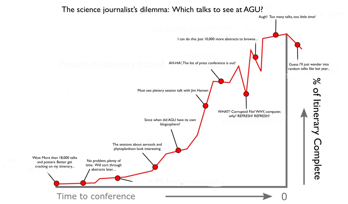
An Experiment: Can Keywords Help Science Writers Capture the AGU Zeitgeist?


Figuring out what talks to attend at AGU can be tough.

The crux of the problem: there are more than 15,000 individual abstracts to pick through, not to mention no small number of other lectures, plenary sessions, and events vying for attention. It is simple enough if you’re a scientist — just focus on the talks and posters related to your area of expertise. It’s a bit trickier if you happen to be a science writer trying extract the zeitgeist of the whole meeting. Indeed, on deadline, the exercise of choosing talks can be near maddening.

To figure out how to focus the bulk of my time and energy this year, I decided to try something new. Rather than simply thumbing through the master list of talks highlighting the those that looked interesting, I am opting for a more quantitative approach. Last night, I downloaded a handy program called Word Counter that, among other things, can tally up the most frequently-used words in a document.

I ran the titles for each day’s sessions (both posters and oral) through the program to see what turned up. The output was fascinating: a bird’s eye view of the topics that scientists are talking about the most. Take the Monday morning session. Word Counter reports that the five most cited words are water (109 mentions), aerosol (100), climate (77), mantle (67), and ice (66). Not exactly shockers (though I wouldn’t have expected aerosol to be so high), but knowing that what these most “buzzed-about” topics did make it much more interesting to go back and pick through abstracts.

Stayed tuned. At the end of the meeting, I will be post more keyword results from Word Counter. Also, a hat tip to the Highly Allochthonous blog for this post, which was the source of inspiration for the graphic above. 


–Adam Voiland, NASA’s Earth Science News Team

Follow us on Twitter at NASAonEarth

Fascinated by earth science? Then follow along on our new NASAonEarth Twitter feed to receive a steady stream of earth science news, notes, and more. This week we are in San Francisco for the American Geophysical Union meeting; keep an eye on the feed for updates from the world’s largest gathering of earth scientists. We also recommend the NASA_EO and EarthVitalSigns feeds for more on NASA earth science.